It’s Time To Bust These Interior Design Myths

Monica Gray - September 29, 2023
Share

Interior design is an art. It takes a certain amount of patience and skill to successfully design the interior of a home and make sure there’s a balance of lighting, color choices, space, and furniture placement. Unfortunately, certain myths exist that may hinder or negatively impact your space, leaving you frustrated and confused. That’s why we’re here to help bust those home interior design myths, so you can have a beautiful home you’re proud of.

Pinterest

Myth: All White Walls Make A Room Look Bigger
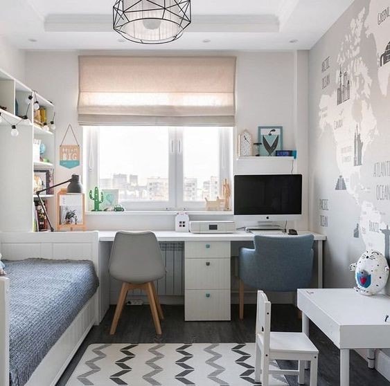
Even though white creates a sense of space in your home, it’s not the only way to make a room look bigger. Painting all your walls white won’t magically make that room seem larger than it is. To achieve this, you’ll need proper furniture placement, proper lighting, and the right color choices to make your room feel more spacious and larger than it is. To achieve this larger room, you need to paint the sashes and trim the same color as the walls. Hadley Wiggens, a designer in Peconic, N.Y., said you need to allow “the eye to travel continuously instead of stopping on some jarring focal point or moment of contrast.” You’ll achieve this with a variety of differences, not only a white wall (WSJ).

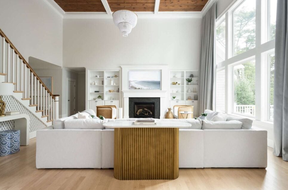
Wall Street Journal

Myth: Small Rooms Should Have Small Furniture

In reality, if you fill a small room with tiny furniture, it will make it seem cluttered and unkempt. Use regular-sized pieces of furniture to maximize space and style. Multifunctional features will give your room a bit of character, without making it seem stuffed to the brim. If you introduce larger furniture in smaller qualities, this will make the smaller room seem bigger than it is. For example, you can use a larger, queen-sized bed in a small room as a focal point (Style at Home).

The Inside

Myth: Matching Furniture Sets Are Essential

You might think that matching furniture is essential for a beautiful, put together room. However, in reality, it’s better to mix furniture styles and pieces for a more eclectic look. This is visually pleasing and creates different focal points around the room. Coordinated furniture is also more captivating. The best homes are the ones that tell a story, which is not what you get with matching furniture sets. Designer Sarah Walker says, “There is no storytelling, no character, no personality. It says, ‘I’m all about minimum effort and don’t care about self-expression.” It doesn’t take much effort to mix and match furniture, and is a lot more fun than buying matching sets (House Beautiful).

PJ And Thomas

Myth: Dark Colors Make a Room Feel Smaller

Though you might assume dark colors make a room feel smaller, the opposite is true. In reality, dark colors add depth and a level of sophistication to a space when used correctly and strategically. You also need proper lighting and the right kinds of contrast to make those dark shades work properly. It’s the same reasoning that white colors do not make a room look bigger. Dark colors tend to push the room back and pull you in. It’s all about the amount of light that you let into the room (PJ and Thomas).

Fast Company

Myth: High Ceilings Always Look Better

You might think that high ceilings will automatically add a feeling of expansion. Even though high ceilings might look beautiful, they don’t suit every space. Sometimes, low ceilings are better suited for a space and can create a cozier atmosphere and allow for more efficient heating and cooling. It all depends on the space you’re in. Designer Matt Gibberd said, “Smaller rooms tend to be cozier, less draughty, and more welcoming. The chocolate-box cottage, with its bendy beams and flagging flagstones, is always going to hold a romantic appeal, in the same way, that a humble workers’ cottage has proportions that feel just right.” Doesn’t that sound wonderful? You wouldn’t get that in a room with high ceilings (The Guardian).

Hii Guru

Myth: You Need to Follow a Single Design Style

There’s no “one style fits all” when it comes to interior design. In reality, an eclectic design that blends different styles has the potential for a personalized, unique look. You don’t have to adhere to only one style. Mixing things up gives your space a bit of a pop, and taking strategic chances when it comes to mixing and matching usually turns out for the better. This is especially true if you have an eccentric, buzzing personality. Why make everything monochrome if that’s not you? (HiiGuru).

BHG

Myth: The Ceiling Must Be White

Never listen to this interior design myth! The ceiling is your fifth wall. Brighten up the room and paint your ceiling a bold color to add a bit of character and personality to an otherwise bland room. Ceilings lighter in color will feel higher, and darker colors will make the ceiling feel lower, though that doesn’t mean it will feel claustrophobic (BHG).

Bower Bird Collections

Myth: Avoid Using Patterns Together

You don’t want to walk into a room that’s showcasing one pattern. How boring is that? It’s always better to mix up patterns to add interest and a kick of personality. The best way to do this is to maintain a cohesive color palette and change up the pattern scales. Determine if you want to bring in some cooling colors or colors that are loud. Because there’s a numerous array of patterns out there, you have tons of choices and liberties when it comes to choosing patterns. Different sizes and prints tell different stories, so you can get creative when it comes to patterns (Bower Bird Collections).

Country Living

Myth: Mirrors Make Small Rooms Feel Larger

We hate to break it to you, but you can’t place mirrors randomly around a room and expect it to look larger. While mirrors do create the illusion of space, they need to be placed thoughtfully around the room to avoid making it feel busy and chaotic. You can use mirrors to improve light, add a bit of texture, and dress a mantel. To create the illusion of space, place your mirrors opposite the window to reflect the view. This makes it seem like there’s an extension of the great outdoors (Country Living).

Home With Keki

Myth: Books Belong On Bookshelves

You don’t have to retire your books to your bookshelves to gather dust, never to be seen. You can take those books and stack them on the floor, the fireplace, or at your office desk. According to Chloe Tozer, “Books are always an arm’s length away in my home. They are one of my greatest sources of inspiration and there is no place they don’t belong. It would be sad if they all lived on a bookshelf.” It’s better to keep them easily accessible than forgotten and out of reach (Home Beautiful).

H&G

Myth: Every Wall Must Have Artwork or Decor

This is one of the biggest interior design myths. You don’t want to cover your walls with artwork. Negative spaces can be as impactful as adorned ones. You don’t have to cover every inch with decor. Sometimes, less is more, especially when it comes to decorating the walls of your rooms. As interior designer Brenda Petrunick says, “As a general rule, every wall does not need to be covered. Often, the best design is completed in stages, with time dedicated to taking in each new layer and letting your eye wander as it discovers blank pockets that need attention, or areas of concentration that should be more evenly dispersed.” This will create various focal points and make the space seem bigger (Homes and Gardens).

House Calls for Physicians

Myth: Wood Tones Should Match

You’d think that wood tones should match. While this might seem like a good idea, in reality, mixing different wood tones can add a certain depth and character that you wouldn’t get with matching wood tones. A harmonious blend with a quirky personality is always more visually appealing than a monochromatic wood scheme. You don’t want it to look like you bought all your pieces of furniture at once. Instead, make it seem like you bought your pieces over time, which will help your room tell a story (House Calls for Physicians).

DIY Playbook

Myth: All Furniture Should Be Against the Walls

If you leave all your furniture against the walls, it will make it look bland and unappealing. We do this by default. In reality, if you pull the furniture away from the walls, this will give your home a more inviting and cozy atmosphere. Floating furniture is appealing and more homely to look at. If you have window space, you should consider putting furniture against the window. There’s so much wall space that’s never used! This creates extra seating and comfort (Houzz).

Hommes

Myth: Everything Must Be New

There’s a reason people collect vintage pieces of furniture and decorate their houses with them. If you mix and match old and new furniture, it won’t make it look like you bought everything on sale at IKEA. It’ll add character and depth to your room. You want your home to tell a story, and you can do that through modern and vintage pieces of furniture (Hommes).

House and Home

Myth: Small Spaces Should Stick to Light Colors

As we’ve seen, using dark colors in small spaces can help your home instead of hindering it. Decorating your interior will dark colors can create drama and intimacy that lighter colors don’t achieve. You’ll need to balance it with proper lighting and furnishings. Interior designer Nike Onile says, “Our eyes are drawn to a change in color, so using similar hues will allow your eye to scan the room with ease. Rather than being afraid of color and dark tones, use contrast to your advantage when you want to draw attention to something worth the gaze.” Use dark colors to your advantage in a strategic way to make your room pop (House and Home).

Pinterest

Myth: Art is an expensive investment

Even though an original Picasso painting might not be in your budget, other pieces of art don’t have to break the bank. The best way to choose the greatest pieces for your home is to spend time looking for the perfect piece. According to interior designer Kate Hardy, “My recommendation for selecting art is to spend time sourcing as widely as possible, from local art galleries and artists to country fairs or markets. My particular favorites are small still life pieces, which often capture a delicious, serendipitous moment in time.” The way a piece makes you feel is always better than the price tag (Home Beautiful).

Arts and Crafts Homes

Myth: Open Floor Plans Are Always Ideal

An open floor plan isn’t always a good idea. Even though they’re trendy, they aren’t necessarily suitable for every lifestyle. Defined spaces can offer functionality and privacy that open floor plans cannot. Even though it might suit some homes, other homes need a defined space. One couple from Arts and Crafts Home bought a house solely because of the teeny tiny ironing room that gave them privacy and a place to retreat and hide (Arts and Crafts Homes).

WSJ

Myth: Small Rooms Can’t Handle Large Artwork

Large artwork can add to a room, not take away from it. Oversized artwork can make a bold, beautiful statement in a small room. It adds a sense of grandeur, attention, and a focal point that you wouldn’t normally get with small artwork. This is often referred to as an interior design trick, and not many people know about it. Even if it fits the entire wall, put it up (WSJ).

Heavenly

Myth: More Decor Equals Better Design

There is a limit when it comes to decorating. In reality, overdecoration can overwhelm a space, making it seem unkempt and cluttered. Oftentimes, simplicity and minimalism can be more impactful than too much decoration. Your home needs a little bit of breathing room to let the other pieces of furniture and artwork speak for themselves (Havenly).

Luxury Launches

Myth: You Need to Put a Table in Front of a Sofa

Let’s debunk this interior design myth right now! You don’t need to stick to this rule. Why don’t you try something different instead, like placing an ottoman with a tray on top of it, or using a vintage cart on wheels? You could even take it a step further and use two stumps of wood with glass accessories or wooden decorations (Interiors Revitalized).

Style by Emily Henderson

Myth: Every Room Needs a Pop of Color

In reality, neutral color palettes can create a sophisticated, serene ambiance that a pop of color can’t achieve. You can add a pop of color through artwork, textiles, or accents. But keep in mind, that it should only be used when necessary. Oftentimes, neutral colors speak for themselves. Interior designer Liz Williams says, “Rather than all the same color, I prefer layer varying shades of a color room to room. Rooms can all be tied together with a common trim paint, but varying the shade ever so slightly can help with the flow of the house. This is easy to do right on a color wheel or by creating custom colors at the paint store.” With the right planning, you can make your neutral color palette pop all on its own (Houzz).

Kozy Kasa Design

Myth: Wallpapers Are Outdated

We’re happy to tell you that wallpaper has made a comeback! Modern patterns and easy-to-remove options add personality and texture to otherwise bland spaces that need a bit of pop and personality. If you use wallpaper strategically, you can make your room stand out. It’s a great accent feature that’s bold and will showcase your personality (Kozy Kasa Design).

Nelson KB

Myth: White Kitchens Are the Only Way to Go

This is far from the truth. While white kitchens are timeless, colored materials and cabinets can create an inviting cooking space that will add some pop to your home. With the right materials, accents, and colors, you can make your kitchen stand out. White kitchens are harder to clean and are becoming more of a fading trend. They’re also cold and lack the warmth that colored kitchens have. To top it all off, they’re pretty boring (Nelson KB).

Quora

Myth: Carpet Is Out of Style

Even though carpeting might seem like a thing of the past, in reality, carpeting can be comfortable and practical. This is especially true in bedrooms that call for more comfort. They’re great choices alongside tile flooring and hardwood. They can be quite stylish and bold, especially if you find a carpet with colors that pop (Avalon Flooring).

Pinterest

Myth: Trendy Decor Is Always the Best Choice

Trendy decor doesn’t always mean it’s a good thing! In reality, while trendy items can add a bit of pop and flair, timeless and vintage pieces, with classic design elements, can oftentimes have a more enduring appeal that you wouldn’t otherwise have with popular trends. It’s best to blend both to have a more balanced, elegant interior. That way, your home will tell a timeless story instead of having one consistent theme (Home Beautiful).

Pinterest

Myth: Natural Light Is Better Than Artificial Light

Even though natural light is an eco-friendly, efficient way of adding light to a home, artificial light might be a better choice in some homes. Interior designer Kate Walker said, “Artificial light can be a useful tool in situations where natural light is limited or unavailable, or when a specific mood is desired. It’s ideal for highlighting specific elements in a room, like artworks or architectural features, and can also control and manipulate the ambiance and mood, with dimmers adjusting the intensity of light.” Using those dimmers correctly can add a sort of ambiance and cozy atmosphere that natural light will never achieve (Kate Walker Design).

Urban Myth

Myth: You Don’t Need A Beautiful Laundry Room

Laundry rooms are one of the rooms your home probably needs the most. They’re rudimentary, functional spaces that oftentimes get overlooked. According to interior designer Kate Walker, “A well-designed laundry can be both functional and aesthetically pleasing. Then add decorative elements, such as an appealing color scheme that matches your home’s decor, some feature tiles, or wallpaper. Don’t be afraid to feature artwork to bring the space to life.” Choose specific materials and lighting for not only their look but their function, too. With this small space comes a lot of creativity. The utility room is on the rise, and for good reason (Urban Myth).

Advertisement