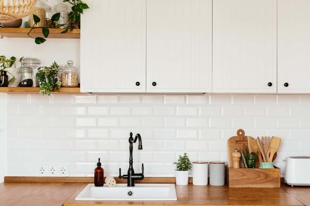
There are so many interior design styles and combinations, and sometimes our taste doesn’t fit into one category. That’s when we look to hybrids of styles for more inspiration, and Japandi is one such hybrid. It’s aesthetic combines the modern, rustic feel of Scandinavian design with the elegance and fine lines of Japanese styles. It’s the best of both worlds! Scandi design favors a humble, monochrome pallet to create a simple and peaceful environment, incorporating neutral shades of creams, grays, and natural warm wood shades for a cozy home feeling. Japanese style has deeper, richer tones and utilizes darker woods and bold colors.
Japanese and Scandi styles work well together because they emphasize the importance of functionality in simplicity, and their differences bring in different elements that complement each other well. While the Scandinavian palette tends towards more neutral, muted colors, the Japanese palette brings in a few intentionally chosen bold or bright colors, making the whole room feel light and open without feeling clinical or stark. Now that you know a bit more about what Japandi design is, let’s look at how to incorporate it into your home!
15. The marriage of the two design styles follow minimalist design ideals.

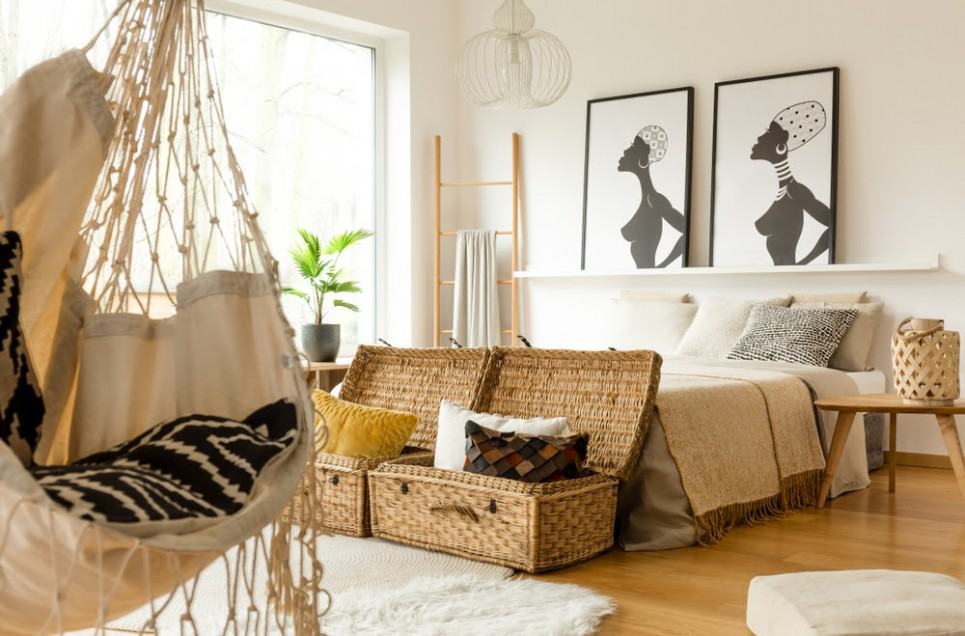
True minimalism can be hard to achieve, but there are ways to fake it! Minimalistic style is a design and art concept that contradicts excessiveness. Thus, it refers to extreme spareness and simplicity. It began in the 1950s in a movement away from consumerism and abstract expressionism. It seeks to bring all elements down to their roots or their essential qualities. Likewise, Japandi strives to take things down to their primary function while keeping their warm, timeless elegance. Japandi adopted other minimalist elements like the open floor plan and clean lines, but we will discuss them later.

If you have too many things and can’t pare down your belongings to the roots, then you can try “faux minimalism.’ To do this, use natural containers like boxes and wicker baskets or built-ins and folding screens to hide excess items and create the illusion of minimalism. Having a home for all your things will make your space feel clutter-free and maintain your Japandi aesthetic without depriving you of the things you want or need. In fact, using sustainable materials like wicker and bamboo is part of the Japandi aesthetic, so keep that in mind as you select your items!