These Maps Give An Interesting Perspective On The USA

Ashley - April 8, 2023
Share

The US is a crazy mashup of different cultures, languages, living environments, and climates. Honestly, when you think about the fact that you can travel from hot, tropical climates to frozen wastelands without ever leaving the same country, it gives you an idea of just how vast and varied the US is. Many people love to pretend they know everything about the US, but this diverse country is full of surprises! Maps give clear, empirical data about what you can expect in different areas of the US, and the results are absolutely fascinating. Want to see some different perspectives on the US that will blow your mind? Check out these maps and prepare to be surprised!

Photo Credit: reeldealanglers.com

US Watersheds

This vibrant map represents all the watersheds across the United States. According to the National Oceanic and Atmospheric Administration, watersheds are “land areas that channel rainfall and snowmelt to creeks, streams, and rivers, and eventually to outflow points such as reservoirs, bays, and the ocean.” Basically, what you’re seeing are areas where water runs into the ocean! The largest pinkish area is the Mississippi River basin, which includes the Missouri, Ohio, Arkansas, and many other major rivers!

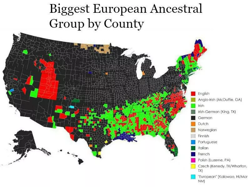
Photo Credit: reddit.com

Red And Orange Areas Have The Same Population

Can you believe the areas highlighted in red and orange on this map have the same population? It’s true that many people prefer to live on the coast, but seeing such a stark difference between land areas is shocking! The orange areas, such as Los Angeles on the West Coast and New York City on the East Coast, cover tons of major cities with high, dense population areas. Much of the red zones cover sparsely populated areas, which is why there’s such a discrepancy in land areas.

Photo Credit: reddit.com

Another Interesting Population Map

This map provides another interesting example of where the highest areas of populations are across the continental United States. While at first glance the map may look confusing, it’s actually very straightforward. The spokes coming out of the map represent high population areas. As you can see, areas along the cost have the largest populations, particularly near the New York City and Los Angeles areas. Some areas look completely barren compared to regions along the cost, but it’s just another example of how diverse and spread out this country is!

Photo Credit: reddit.com

Best Route Between Every Springfield In The US

This fascinating map shows the most efficient route a person can take to visit every city named Springfield in the United States. There are 41 cities spread across 34 states called Springfield in the US, and as you can see on the map, they’re pretty spread out. Most English-speaking countries have cities named Springfield, and there’s certainly a large number of them in the US! Now, for extra fun, you can end your trip in Springfield, Oregon, and catch a glimpse of where the Simpsons took place!

Photo Credit: buisnessinsider.in

Most Common Language Other Than English Or Spanish

Everyone in the US knows that English is the most commonly spoken language, followed by Spanish and then French. But what about other languages? Well, this map represents the most common languages spoken in the US other than English or Spanish on a state-by-state basis. Are you surprised to see how common German and Vietnamese are throughout the US? Did you expect to see Tagalog? This map shows just how diverse the US truly is, and it’s amazing how many different languages and cultures have come together in this country.

Photo Credit: reddit.com

Alaskan Perspective On The US

Most maps of the United States show Alaska and Hawaii as small bodies of land off to the side and focus on the 48 contiguous states. This map gives us the opposite perspective, where Alaska is the main body of land represented, and the other areas of the US are featured off to the side. It’s quite fascinating to look at from this perspective, and you can see that the small map of the lower 48 isn’t particularly detailed and only mentions a few major cities, like San Francisco. It just goes to show how different people who live in the same country view the United States!

Photo Credit: reddit.com

How A Brit Views The United States

Have you ever wondered how people in other areas of the world view the United States? Well, this map was created by a person from England and shows what they think of the US based on what they’ve heard and seen in the media. Most of the states on the map have been colored in to represent “Yee-haw states” or “nothing special.” We love the key this person created, which features areas such as “small and confusing,” “river,” and “chicken.”

Photo Credit: reddit.com

States With A Smaller Population Than Los Angeles County

The states in this map highlighted with blue each have a lower population than Los Angeles Country, which is highlighted in red. It’s hard to imagine that a single county can have a larger population than an entire state, but it’s true! Los Angeles county has roughly 9.83 million people. To put that in perspective, there’s less than 5 million people living in the entire state of Oregon! If you haven’t traveled around the US much, then this map probably comes as a major shock. Those who have traveled through the country, especially the mid-west, will accept this data more easily.

Photo Credit: realtor.com

Dog States vs Cat States

Nearly everyone in the US owns a pet! A recent article from Forbes shows that 70% of American households (about 90.5 million homes) has a pet. Most people own either a cat, dog, or both, and conversations about whether you’re a cat or dog person can become pretty heated in the US. This map shows which states have more cat owners vs dog owners, and which states are tied. The majority of states are tied, but interestingly enough more states in the south have dogs while states in the north have cats! Could this be due to climate or culture?

Photo Credit: reddit.com

Tree Cover Map Of The US

This map shows the density of trees throughout the United States. The majority of trees are found along the coasts, and the middle of the country looks like a barren wasteland! The middle of the country has several desert areas and a very different ecological environment compared to the rest of the country. If Alaska had been included in this map, it would likely have a large density of trees. We love this map because it provides a sharp view of the contrasting climates found across the United States!

Photo Credit: digg.com

Most Googled “Should I” Question

Everyone turns to Google when they have a mundane question they need answered, and it’s fascinating to see which questions are the most popular across the states. Back in 2018, Google Trends and AT&T gathered the data to reveal which questions were most popular in which states. Many questions repeated themselves across various states like, “Should I Text Him” and “Should I Vote,” but some were more singular. We have to wonder what was going on in Minnesota to make so many people Google if they should freeze their credit!

Photo Credit: reddit.com

How Much Snow Is Required To Cancel School

Those who grew up in areas that get large snowfalls know the excitement of waking up in the morning and watching the local news to see whether their school’s name pops up as canceled or not. Of course, kids can probably just check on their phones now! Regardless, it’s interesting to see the difference between states here. Some states won’t cancel school unless they receive more than two feet of snow, but others will cancel if they get any snow. Areas that cancel when they get any snow generally don’t have the snow plows and equipment other areas have that are needed to clear the roads.

Photo Credit: frozendessertsupplies.com

Most Popular Ice Cream Flavors

Americans definitely have a sweet tooth, and ice cream is one of the most popular desserts across the country! This map shows people’s favorite flavors in each state (excluding the basics like chocolate and vanilla). Strawberry is surprisingly unpopular across the US, while cookie dough and coffee reigns supreme. Sorry to the mint chocolate chip lovers out there because most people do not appear to agree that is the best ice cream flavor!

Photo Credit: reddit.com

Most Common Last Names

Despite having such a diverse population filled with a multitude of different cultures, there are some last names that are incredibly common throughout the US. This map shows the most common last names based on location, and the results are fascinating! It’s no surprise that Smith is so common since this country was primarily founded by British settlers, but it is a little shocking at how much of the US it encompasses! Other common last names like Johnson and Williams are also unsurprising, but cover a much smaller geographic area.

Photo Credit: reddit.com

States That Hate Other States

This map should give most Americans a laugh! Using the key, you can see which state is hated by other states. It appears the most hated states are California and Texas, while the rest of the states are hated pretty evenly. New Jersey apparently hates everyone (which sounds pretty accurate if you know anyone from New Jersey!), and no one seems to hate Connecticut or Oregon! If you live in the US, does this map match up with your personal beliefs?

Photo Credit: buisnessinsider.com

Most Loved Emoji In Each State

Everyone loves using emojis, but have you ever thought about what the most used emojis are across various states? This map gathered data to compare the trend of which emojis are used in which states to bring us- The United States of Emojis! According to this map, people in Texas prefer the grape emoji while those in Hawaii prefer a person surfing. It shouldn’t come as any surprise that the people in Iowa use the corn emoji most frequently!

Photo Credit: reddit.com

Most Common Country Of Birth (Excluding Mexico)

Have you ever wondered where the majority of immigrants in your state were born? This map shows the most common country of birth for foreign born residents, excluding Mexico. It shouldn’t come as much of a surprise to see that India and Canada are the two most common countries of origin, followed by the Phillipines. However, some of the other countries, like Somalia and Ethiopia, are probably less anticipated. This is another heartwarming example of how diverse the good ole US of A is!

Photo Credit: foodbeast.com

Most Hated Food In Every State

There are plenty of maps showing what each state’s favorite food is, but here’s a map showing the exact opposite. This map puts each states most hated food on display, and the results are both hilarious and surprising. Who knew Floridians hated licorice so much? Or that New Mexicans hated chicken nuggets? We’re not too surprised that Alaskans are against voss water or that Oregonians hate fast food. Find your state on the map and see if your personal preferences match up!

Photo Credit: reddit.com

Shocking Population Map

Take a good look at this map for a moment. There are more people living in the red areas than the grey areas. This is pretty shocking considering there are only a handful of tiny red spots in a vast sea of grey, but it’s 100% true! The majority of the population in the United States lives in major cities spread throughout the country. A large percentage of the population lives in New York City, Los Angeles County, Chicago, IL, and Houston, TX. As one redditor pointed out on the original post, this map should be a glaring example of why the electoral college system is so problematic!

Photo Credit: foodbeast.com

What Each State Hates The Most

We already showed you a couple of maps showing different preferences in states like which emojis are used the most or which states hate other states, but this map shows what each state hates the most. Alaskans apparently hate graffiti the most while the people in Hawaii hate taking videos at concerts. The rest of the states have some very interesting opinions and we’re not too sure how to feel about some of it. Why do Georgians hate tuna salad? North Carolinans may want to think about why they hate DUI checkpoints so much!

Photo Credit: theguardian.com

Drug Overdose Deaths

This map shows a saddening reality of the increasing drug problem throughout the United States. The map on the left shows the number of drug overdose deaths per 100,000 persons in 1994, while the map on the left shows the same data but for the year 2014. It’s shocking to see such a massive increase in drug related deaths in only a decade. This is a shocking reminder of the need for more targeted support throughout this country for drug rehabilitation services.

Photo Credit: visualcapitalist.com

Top Private Employers In Each State

Most people rely on their local Walmart for groceries, clothes, electronics, and various other merchandise. Walmart has become something of a monopoly throughout the United States because it offers a large variety of products at low prices. This map shows the top private employers based on state, and it’s shocking to see in how many states Walmart is the top private employer. They’re the largest employer in 22 states, and other states mostly have healthcare or college systems as their top private employers.

Photo Credit: nps.gov

Loudest And Quietest Spots In The US

At first glance, you may think this is a light map showing the brightest cities around the country, but that’s not the case! This map shows the loudest and quietest spots in the continental United States, and the results are stunning. The quietest spots are, unsurprisingly, in the desert areas, while the loudest spots are mainly found along the East Coast. New York City is particularly vibrant, as are a few areas in Florida.

Photo Credit: wikipedia.org

Adult Incarceration Rate Per 100,000 People

Looking at this map, you may be surprised to see that a few states in the southeast have the highest incarceration rates in the continental United States. Louisiana has the highest number of incarcerated adults, yet Alaska has the highest incidents of crime in the United States. This map would be useful for people looking for the safest and lowest crime area of the United States to move to!

Photo Credit: abandonedraillines.com

Out Of Service Railways

The United States is one of the few developed countries that doesn’t have an extensive working railway system. Most developed countries rely heavily on public transportation and trains are a big part of their public transportation systems. The US has tons of abandoned railways, as you can see on this map, and it’s surprising that there isn’t more of a priority placed on fixing up these railways and turning them into reliable means of transportation again. It would be more environmentally friendly and financially responsible than expecting every adult in the US to own and drive a vehicle!

Photo Credit: barstoolsports.com

Most Popular Celebrity By State

Barstool Sports analyzed search engine and social media trends back in 2018 to determine the most popular celebrities in each state. The data revealed a wild mix of politicians, musicians, historical figures, Youtubers, Instagram models, and athletes. We have to wonder what this map would look like now- five years later! We imagine certain names, like Jeffree Star, would no long be found anywhere on this map!

Photo Credit: reddit.com

Desire To Leave The State

It’s a running joke in many states that people desperately want to move away and warn others not to move to their state. This map shows the desire residents of each state have to move, ranging from lowest desire to move to highest desire to move. Texas and Oregon are two states with the lowest desire to move, while Connecticut and Illinois have the highest desire to move. We imagine factors such as weather, economic growth opportunities, and crime rates have much to do with resident’s desire to leave or not. Of course, this map is a little outdated now, so we have to wonder what it would look like today.

Photo Credit: earthobservatory.nasa.gov

Tornado Tracks Across The US

Most people assume the majority of tornados take place in Kansas and other areas of the midwest, but this map proves them wrong! The bright streaks across this map shows where tornados have struck, and the brighter the light is, the stronger it indicates the tornados have been. As you can see, tornados mostly take place on the eastern half of the United States, with the strongest being closer to the middle of the country.

Photo Credit: cdc.gov

Most Distinctive Causes Of Death

This map represents the most distinctive causes of death per state from 2001 to 2010. The CDC released this graph to show what was affecting each state the most outside of natural causes, and the results are equal parts fascinating and terrifying. Who knew Texas still had such an issue with tuberculosis? And apparently Connecticut needs better medical care for females! This map really shows the darker side of these states and the issues they’re still struggling with.

Photo Credit: reddit.com

Most Popular Coffee Shop Chains

Most people who live in the United States know that there are only two big coffee chains in this country; Dunkin and Starbucks. Apparently, one state has a different large chain called Caribou, but every other state is firmly on one side of the Dunkin/Starbucks debate. Starbucks appears to be slowly taking over the country as the largest coffee shop chain, but Dunkin is still hanging in there with the majority in Florida, Illinois, and most of the Northeast.

Photo Credit: reddit.com

Lowest Temperature Recorded Per State

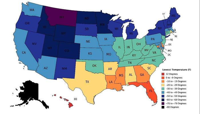
It’s no surprise that certain areas of the United States, like Alaska and Montana, have had some insanely cold temperatures on record. It probably also doesn’t come as much of a surprise to anyone that Hawaii’s lowest recorded temperature is only twelve degrees. Some areas of the US have experienced truly astounding low temperatures, while others have been spared from such extremes. This country has a wild range of temperatures and climates!

Photo Credit: safewise.com

Most Dangerous States For Driving

Driving is a necessity for most people in the United States since this country doesn’t have much for reliable public transportation. This map was created by Safewise in 2017 to show which states were the most and least dangerous to drive in. The safest states are Massachusetts, Rhode Island, New York, New Jersey, and Washington. The most dangerous states are Wyoming, Mississippi, Montana, New Mexico and North Dakota. Most of the deaths related to driving are attributed to speed and the most dangerous states are also the worst in terms of DUI accidents.

Photo Credit: reddit.com

Light Pollution In The United States

Light pollution can be a major issue as it disrupts natural sleeping rhythms, attributes to increased levels of carbon dioxide in the air, and obscures the stars from the night sky. This map shows the areas of the United States that suffer the most from light pollution, and the results are shocking. Nearly the entire eastern half of the country suffers from severe light pollution, along with a portion of the West Coast. People looking to avoid light pollution will need to settle somewhere in the midwestern part of the country!

Photo Credit: estately.com

States With The Most Couch Potatoes

There’s no harm in vegging out after a long day at work in front of the television or your favorite video game, but some people spend the majority of their lives sitting on their couches. Estately analyzed a bunch of data including hours spent watching TV, fast food restaurants per capita, obesity rates, frequency of exercise, and more to determine which states had the most couch potatoes. Apparently, the states with the most people who prefer to chill on the couch are Ohio, Alabama, West Virginia, Arkansas and Louisiana.

Photo Credit: reddit.com

US Education Spending Map

This map shows how much money is spent on students based on the national average, and the results are honestly pretty shocking. The orange and red areas spend far less per student than the areas in green, yet the orange and red areas dominate the country. This shows just how uneven the educational system is throughout the United States, and proves what many people have been saying for years- which is, we need a more equal educational system throughout the country!

Photo Credit: wikipedia.org

Biggest European Ancentry Groups By County

We all know and love that the United States is a multicultural country filled with cultures from all over the world. While most people in the US used to be descendants of the original British settlers, there’s now a much larger diversity across the country. The biggest European ancestery group throughout the United States is German, with English and Irish coming as close runner-ups.

Photo Credit: reddit.com

8 Million Miles Of Roads, Streets, And Highways

This fascinating map shows the full extent of the eight million miles of roads, streets, and highways across the United States. It almost looks like veins moving through the country, and it’s a startling reminder of just how dependent on vehicles we are in this country. You truly can’t get anywhere without your own vehicle is most places, especially rural areas, but there’s also something comforting about how interconnected the entire country is.

Photo Credit: cabletv.com

Top Holiday Movie By State

Holidays are a time for massive celebrations around the United States. Many public places start playing holiday music as early as October, and you’ll forever hear jokes about this movie or that. This map shows which state prefers which holiday movie, and the results aren’t too surprising. Most states love Elf and Home Alone, while others are fans of Scrooged or It’s A Wonderful Life.

Photo Credit: reddit.com

Garbage Can vs Trash Can

One of the funniest things about the US is the different way people talk about things depending on which region they’re in. There’s the way different regions say soda, pop, or cola, and the difference between Northern and Southern states when it comes to saying “you guys” vs “y’all.” These are regional differences most people are aware of, but did you know that some regions say garbage can while others say trash can? Apparently, garbage can is more common in the West, while trash can is more common in the East. Who knew?

Photo Credit: today.yougov.com

Most Popular Lay’s Snacks By State

Lay’s is owned by Frito-Lay, which also owns Doritos, Cheetos, and Tostitos, which makes it one of the most popular snack companies in the United States. Everyone loves to reach for a salty snack on occasion, and this map shows which salty snack is each state’s favorite. Nacho cheese Doritos and classic Lay’s potato chips seem to be the favorites in the majority of states, and then you have outliers like Alaska that prefer Kettle brand chips. It’s always Alaska!

Photo Credit: metrocosm.com

UFO Sightings Across The US

This map was created in 2015 and displayed more than 90,000 places where UFO sightings were recorded, dating all the way back to 1905! Many people believe there is life on other planets, and a shocking number of believe genuinely believe to have seen extraterrestrials or spacecraft at some point in their lives. The states with the highest number of sights per capita are Washington, Montana, Vermont, Alaska, and Maine.

Photo Credit: reddit.com

Average Size Of US Apartments By Region

We all know there’s a major housing shortage in the United States, which was partially fueled by the pandemic. This map shows the average size of apartments in the United States by region, and it’s very interesting to see which states give you more room. The Southeast offers the highest square footage, with an average of 975 sqft. The area offering the lowest square footage is California, offering only 837 sqft.

Photo Credit: pinterest.com

Minimum Wage Per State

The minimum wage in the United States never seems to catch up with the cost of living. Regardless of where you live, if you’re making minimum wage, you’re likely struggling to make ends meet. This map from 2019 shows the minimum wage in each state, and it’s shocking how many states still followed the Federal minimum wage of $7.25 per hour. Washington D.C. offered the highest minimum wage at this time of $14 per hour, with California and Washington coming in second and third.

Advertisement