TikTok Home Design Trends that People are Obsessed With

Alli - November 28, 2021
Share

Move over Instagram and Facebook! It’s time to let TikTok reign supreme. At the beginning of 2020, when the world went to hell in a hand basket, many people resisted signing up for their own TikTok account. Many believed that the former music-driven platform was a cringey trend for angsty teens. But in the past couple of years, if you’re not on TikTok, you’re probably not up to date on the latest trends. And we’re not talking about dance challenges or funny videos. Most trends nowadays are evolving from the short 15 second tp 3 minute videos that the video platform offers. In fact, the algorithm will match you up with the things you’re most interested, say… home design?

That’s right, even home design trends are being created (and rejected) on TikTok. So if you’re not up to date and scrolling through the “For You Page” on TikTok, chances are you’re pretty behind on what the hottest home design trends are at the moment. And luckily for all of us, there’s a wide range of home design trends that we can all find appealing. So if you’re resisting the new wave of social media, don’t. Maybe us showing what TikTok is doing for home design will change your mind. But don’t stress. At the end of the day, you have to design your home the way it makes you happiest. But these tips could inspire a fresh perspective if you’re bored with your home design.

Sorry, guys – this pic is an example of farmhouse style that is completely out of date. Shutterstock.

Trend Fatigue: Why Trends Come and Go
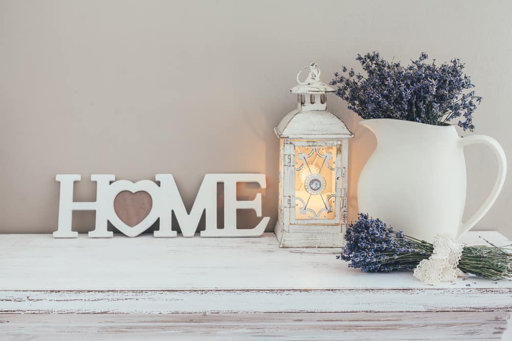
We’ve all seen it happen. At first, the cute writing on the barn wood and personalized touches for farmhouse decor was considered the peak of homey versus trendy. But now? Not so much… We hate to break it to you, but because these trends were so overdone, they hit the point called “Trend Fatigue”. Sometimes this is also known as “Fad Fatigue”. And it doesn’t take a rocket scientist to figure out what that means. And farmhouse decor is the perfect example of this. But don’t worry! There are still some elements of farmhouse decor that really can still work. So you don’t need to throw out all of your barn wood just yet. It’s just important for your home design to evolve with the times.

Trend fatigue tends to happen when something like farmhouse style blows up. We saw it everywhere on HGTV, and we consider the Mother of Farmhouse Style to be Joanna Gaines. Who is still a very talented interior designer. But focusing on these trends and playing to the same tune for going on a decade does get old. It’s been 10 years and if you walk into a Home Goods store, you have to wade through the farmhouse decor for something unique. Take the picture above for example. The overly white washed faux antique table is an element that is too overdone now. Along with the wooden “Home” sign and similarly white washed lantern, this is a recipe for looking 10 years out of date. But don’t throw them out just yet! There are ways to update some key home decor elements to fit it into a newer style. Well maybe throw out the home sign. Why are you trying to label your home? You already know it’s your home!

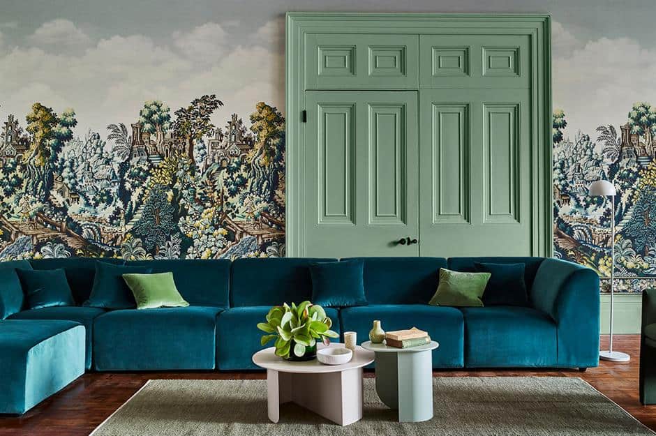
Organic modern deals with contrast in earth tones and organic textures. Shutterstock.

‘Organic Modern’ is Blowing UP

Organic modern is a real buzz word here lately. For home design, this is an extremely hot trend. In this trend, we’re seeing a wide variety of natural materials incorporated into the home decor. This includes stone, woods, ceramics, and the occasional lime wash walls. While this is not a far cry from some other trends we’ve seen in the past, it is interesting to see why this particular home design is trending. Many people believe it may be due to the fact that sustainability and climate change is at the forefront of people’s minds. So this style is heavily focused on earthy elements.

Another way to describe this trend would be “Contemporary Rustic”. You see this a lot with incorporating old barn woods into designs as well as the ceramics and stones we already went over. This style consists of tons of earth tones. But there can be a bit of contrast. In many of the shots we see for organic modern, it seems as though people like to contrast whites or creams with a lot of dark stone accents. Starting with a bright, neutral base and then adding in these earthy textures and elements really makes this style pop. Another earthy element to add to this home design style is pretty obvious: plants. You can either go for a few live plants or dried plants in vases make for delicate accents.

Incorporate things that make you happy and lovely colors and textures into your kitchen. Shutterstock.

Colorful Kitchens – All White Kitchens are Out

This is a great trend coming into style considering a touch of paint can keep you in trend. Don’t get me wrong – there is something very fresh and clean about an all white kitchen. Unfortunately, it’s no longer a trend because it lacks any type of personality. Something that Millenials and Gen Zers want back is a little bit of individuality in their home design. And as for a kitchen? Well isn’t that a place that deserves some flavor? There are ways to keep a kitchen feeling fresh, open and clean without needing to go with the sterile atmosphere of all white everything.

You don’t have to give up your white countertops, because changing those entirely can get very pricey. You don’t even need to paint over your white wall. But painting your cabinets a lovely jewel tone could really do the trick. Once again, incorporating different textures and patterns into your kitchen can also set it apart. If you’re looking for a fun project, why not also install some floating shelves for some lovely dishes and plants? You can also display cookbooks, hang pots and pans, or simply just find some cool decor to set on them. This really brings some personality back into your home design. The great thing about this trend is that you don’t have to follow a certain recipe (pun intended). Just think about colors and kitchen items that make you happy – you could design a whole space around your favorite things!

Open concept plans can interfere with work-life balance. Shutterstock.

Open Concept Plans aren’t As Good as People Thought

While the idea of a wide open, clean space appeals to a lot of people, in the last couple of years, people have started to see the flaw in that home design element. That doesn’t mean you need to close off your space, because this is definitely a trend that can vary from person to person, but many people are veering away from this. Why? When the crisis of the last couple of years hit, people realized they wanted a more separate space to work from home. It’s hard to focus and get work done in a room where you want to cook, relax, and visit.

It’s actually always been pretty important to keep your workspace and relaxation space as separate as possible. We know it’s not always the easiest plan when you don’t make that much money or live in a small apartment. But when you’re talking about tearing out walls to open up your entire living space… it doesn’t always make the most sense. And when you’re on Zoom calls and don’t have anywhere private to go other than your bedroom, that turns into a whole other issue. So this trend isn’t so much “wow, this is ugly, let’s get rid of open floor plans” it’s more analyzing the practicality of the new work-home lifestyle we have seen in recent years.

Gender neutral nurseries are so much cooler. Shutterstock.

Gender Neutral Nurseries

As we see more and more people realize that the traditional social constructs are limiting for all genders, we’re gonna start seeing people having more creativity with nurseries. The traditional pink and blue nurseries just aren’t it. And why limit yourself to such a tiny color palette? Babies don’t care if their walls have pink elephants or blue whales! Once again, it’s time to veer away from home design trends that box us in. It’s time for some creativity when it comes to decorating a space for your baby. Widen your baby’s color horizons to more than a spectrum of blue or pink.

Aren’t we exhausted by telling our sons they can’t like pink because it’s “too girly”. Or calling our daughters “little princess”? Come on – let’s get some originality and adaptability going in our kids’ lives. You may be thinking – pink and blue are just colors. So if you love pink or blue, go for it! Just don’t limit yourself or your kid if you don’t want to stick to those. Just like we shouldn’t limit their interests. Your daughter loves football? Sweet, get her some football blankets. Creating a gender neutral nursery will foster a space where a kid doesn’t feel forced into interests or skills from the very beginning of life.

Black window frames are in. Shutterstock.

Black Window Frames are Super Trendy Right Now

This one has stuck around for several years now. But both black window frames and picture frames seem to be super in fashion right now. This goes for interior or exterior. Framing your window in black trim could really transform a space and make your window design stick out. Some people believe this trend is in style because a black frame reminds us of artwork and just outlines things better. It also highlights the outdoors a bit more and brings the focus to the outside world. If you have a white wall, a black window frame will stick out a lot more than a white one would.

This can also go for interior archways that have trim. Basically, black accents are a big home design topic at the moment. And once again, the nice things about a certain color being in style means that all you need is a can of paint. And if it goes out of trend again? Well, buy another bucket of paint a few years down the road! It’s an easy trend to follow because it doesn’t require buying tons of supplies or decor. It just takes a couple of gallons of black paint and a free weekend.

Archways soften spaces and give an original vibe. Shutterstock.

Rounded Archways

We’ve seen rounded archways in home designs long before now. But like many things, trends can come and go. This one is definitely coming up in a lot of home renovations. Obviously, this is a harder one to achieve if you rent a home/apartment or you don’t have the money for an elective renovation, but it’s a trend nonetheless. It seems as thought this trend is being born out of being bored with straight lines. The minimalist and modern farmhouse home design trends really rely on straight edges and rectangular shapes. Such as barn doors. But it seems as though the store rounded option is a subtle departure from that.

Rounded archways can have a lot of optical benefits in a space. It can soften a space a lot more than a rectangular archway can. And it can also help your ceiling appear a bit taller. You can have quite a bit of variation for round archways. They don’t always have to be in the central areas. If you have a substantially-sized pantry, create an archway separating it from the kitchen. Another great option is a round archway leading into an office/study. You can always get a beautiful wood/windowed door to add some appeal to an office archway.

Grandmillenial style. The Glam Pad.

‘Grandmillennial’ Style Just Keeps Gaining Traction

For a while, minimalist home decor trended. But this home design trend has surfaced in answer to sleek minimalism – opting for a more maximalist look. Another reason why this could be trending could be that thrifting and saving money in Millennial culture has taken the front seat in home design. This trend may seem a bit funny to some, because it really revolves around a few home decor and design elements that may be considered outdated in today’s terms. Some people may even call it “Grandma Core” or “Cozy Core”. But the people who are leaning into this design trend are all about cozy spaces and nostalgic feelings. Which makes sense after the last couple of years we’ve been through.

From this aesthetic, you can see that people probably got most of their materials thrifting. Mixing patterns, florals, and colors in a softer color scheme seems to be what creates this unique style. It’s okay if this design style is not for everybody. It definitely would challenge some ideas of what’s trendy or what’s considered stuff or outdated. But you can’t help but be intrigued by a new generation of people who find such comfort in this unique home design style. You’ll see a lot of darker furniture, slip covers for couches, wallpaper, and tiny art. Many people are even incorporating this style into their wardrobes.

Hidden kitchen pantry. Pinterest.

Hidden Kitchen Pantries

This one may be a trend for the fancier side of TikTok. Not everybody can afford a fancy hidden kitchen pantry. But this is a trend for obvious reasons. It’s nice to feel like your home isn’t cluttered with all of your pantry items. This is probably more for a family home where you have kids and lots of snacks that go along with having kids. But this is definitely more of a practical home design trend. It’s not just based on how things look – sure the hidden aspect does. But the functionality of this type of design element is endless.

Another practical factor in a hidden pantry is that you can stock up on home essentials and supplies – sometimes saving money later on. But how can you achieve a hidden pantry? It might be difficult if you have limited space. But if there is an extra closet hanging around the kitchen area that feels like it isn’t serving much of a purpose, you could potentially renovate it to make it into this hidden pantry idea.

A bold wallpaper can really add something special to your space. Love Property.

Bold Wallpaper

Yup, that’s right. Wallpaper is back in. And there are some really cool options for wallpaper these days. And it isn’t such a pain to apply like it used to be. They even make renter friendly wallpaper. So this is a great home design trend for anybody. It can totally transform a space and it’s not just for bedrooms or living rooms. Many people are bringing bold wallpapers into their bathrooms or kitchens for a pop of personality. And you really aren’t limited on what type of wallpaper design to choose from. But try to look at unique wallpapers. Don’t go for the safe options you typically find at Target or TJ Maxx. Chevron prints, large modern florals, and stripes could make your space look outdated and tacky.

Truly go for it if you’re going to commit to bold wallpaper. You can go for bold scenes, woodland creatures, romantic florals, or some cool 70s inspired print. Make sure to take your time and find a wallpaper that captures the right vision and vibe for your space. Your wallpaper may be with you for a while, so you might as well enjoy the searching process. Luckily for us, contemporary wallpaper requires a lot less maintenance and time. Your ideal wallpaper is out there, so have fun finding it!

Art Deco style. Shutterstock.

Art Deco

When it comes to unique and sleek style – it’s hard to beat Art Deco. From its outset. Art Deco was influenced by the bold geometric forms of Cubism and the Vienna Secession. Art deco (c. 1908 to 1935) began in Europe, particularly Paris, in the early years of the 20th century, but didn’t really take hold until after World War I. It reigned until the outbreak of World War II. The bright colors of Fauvism and of the Ballets Russes; the updated craftsmanship of the furniture of the eras of Louis Philippe I and Louis XVI; and the exoticized styles of China and Japan, India, Persia, and many more.

During World War II, Art Deco fell out of fashion and was disused until the 1960s when it saw a resurgence in interest. It was lovingly revisited, and still is today, as a style that harkens back to time quite different to today in between two the two World Wars and amongst the hardships of the Great Depression. But we’re so lucky this iconic home design style is coming back with a bang. But of course it’s going to have its modern twists. It seems to be making its rounds on Tiktok home trend videos in recent months.

Dark academia. Pinterest.

Dark Academia for the Scholarly Romantics

TikTokers are absolutely obsessed with Dark Academia aesthetics. And for good reason. There is nothing better than a mix and match approach to the libraries that create the iconic looks. This aesthetic is one that pays homage to the Classics. The term ”Academia” describes a group of aesthetics that are connected to learning, primarily through reading and intensive research. The different variations of the social media subcultures are visually distinct from each other while focusing on different cultural beliefs, ideas and eras.

The general feeling the aesthetic should invoke is rain dotted windows, leather journals next to candlelight, rows upon rows of classic books, and dark gothic art. And this is not only a home design style, this is another trend that bleeds into wardrobes as well. And fall and winter are the perfect times of year to achieve these looks with black turtle necks, tapered trousers, and wool overcoats. Dark academia’s greatest influence are European cultures. Renaissance, Baroque and Romanticism are popular epochs. Especially when their paintings or sculptures deal with themes such as anatomical studies, classical as well as Christian mythology or the transience of life, also known as the vanitas motif.

Home libraries should have unique elements for you. Pinterest.

Home Libraries

While the beginner of home libraries may have a lovely white Ikea shelf, the pinnacle of home library style creates a more cozy atmosphere. An entire section of TikTok known as “BookTok” rules this home design trend. The beginners dipping their toes into home libraries have volumes of their favorite books displayed prominently on white shelves – and sometimes arranged in rainbow order. While this is a lovely tribute to your favorite books, for it to be a true home design style, we need to add a bit more personality and flare to it.

While it may seem that this trend is a bit picky, it actually leaves so much room for the decorator to create their own unique space. You can even design it around your favorite genre. If you’re into romance books, you can go with a soft color scheme and maybe have a cozy loveseat with a gauze canopy hanging over. Adding twinkle lights will give you a romantic vibe. If you’re a fantasy lover, you can lean into the collectable niche of book fandoms. Authentic swords on a wall, maps for your favorite fantasy worlds, and warm candles will whisk you away into another world. The possibilities are endless.

Real art in your space can bring a timeless effect to the room. Pinterest.

Adding Real Art Pieces to Your Room

It’s time to retire the cheap art pieces you found at that Home Goods store. Today’s trends are all about supporting small artists. Yes, they are a bit pricier, but instead of dishing out money to a huge commercial store, wouldn’t you prefer to support a real person trying to make it in the art world? It also makes for a much more interesting conversation piece than a mass produced print. If you can’t afford to buy original art pieces from an artist, that’s okay! Many artists offer affordable prints in their online stores.

Another great option for finding interesting art pieces is to go thrifting. You can find really cool art pieces that may already be set in amazing frames. This is also an affordable option to get on board with this trend. And you know what else? There may be a hidden artist inside of you. Why don’t you go out and buy some canvas and find some artistic inspiration. Be careful to not just try to recreate another artist’s work. It’s okay to get inspiration from then – heck, artists inspire other artists all the time. However, the whole point of creating your own artwork to go in a room is that it’s completely unique to you. Paint something meaningful – which could even be you throwing paint at a canvas to get some emotions out.

These herringbone floors are just the tip of the iceberg in hardwood flooring designs. Pinterest.

Patterned Hardwood Floors

We’re all suckers for good hardwood floors. Over the past couple of decades, many home buyers discovered hardwoods underneath ratty old carpets. Refinishing the hardwoods seems to be a trend that doesn’t seem to be going anywhere anytime soon. But many people take their love for wood flooring in home design to the next level. Patterned hardwood floors are taking center stage right now. All wood flooring adds texture, but the patterned hardwoods give a big boost to that textured look. Choosing an installation pattern for new flooring can be as big of a decision as the style you choose.

Bamboo flooring comes in three primary wood grains: vertical, horizontal, and strand woven – in addition to the numerous colors and finishes associated with traditional hardwoods. Oftentimes, it is important to consider the direction of the grain when deciding between different wood floor patterns. You can choose from parquet, herringbone, chevron, and diagonal flooring patterns. But you can even go past that – and have actual designs in your flooring! You don’t have to leave the artistic creativity on the walls. Having a little pizzazz on the floor will surely leave people talking.

Maximalist decor is in. Pinterest.

Maximalist Design Replaces Minimalist

In recent years, we’ve seen a major change with the minimalist movement. But I think many agree that a minimalist lifestyle isn’t always the easiest to achieve. Marie Kondo told us to get rid of everything that doesn’t spark joy… but what happens if lots of stuff sparks joy for you and you want it ALL on display? Well we’ve got good news for those people. Maximalism is the new trend. That’s right, it’s exactly what it sounds like. You can have all of the things you want. Of course it needs to be arranged tastefully, lest you toe the line of hoarder.

This particular home design style revolves around rich colors, diverse textures, and beautiful art. Books can be included in this too. The philosophy can be summarized as “more is more”, contrasting with the minimalist motto “less is more”. “Maximalist design is all about expressing your individuality and unique perspective,” explains Courtney McLeod, designer and owner of Right Meets Left Interior Design. “Maximalists don’t care what the ‘Joneses’ will think; they design for their own joy, incorporating well-considered and bold color palettes, interesting prints, statement lighting, and curated accessories. For me, it’s not about too much stuff in a space — it’s about creating a bold and interesting mix for the eye to enjoy.”

Curves are replacing straight edges. Italian Bark.

Give Us the Curves

This could also include the earlier archway trend we’ve already discussed. But curves can fit into so many different home design aspects. From architectural elements like archways to rounded furniture, it seems that everybody is liking it a little more curvy. This seems to be a departure from these really clean lines that come with minimalism. The softness of curves is a bit more inviting in this trend. Honestly, adding curvy elements can be in almost every element of home decor. Rugs, ceilings, windows, doors, sofas – you name it. It’s possible to incorporate this trend into it.

After many years when the straight lines inspired by 20th-century modernism have been the norm, as well as synonymous with a contemporary style, taste is changing in the opposite direction. From now onwards, curved lines and features once considered old-styled such as arches and curvy edges are synonymous with contemporary and on-trend. Curves reflect our desire for a soft, cosy and also happy home, after these two hard years. Since the early 20th century, arches and curved have been considered retrograde – but today we look back to them, probably because “tired” of them, and we are fascinated by the beautifully crafted expression of the 19thcentury Art Nouveau.

Kitchen organization is a home design trend. Shutterstock.

Super, Over the Top Kitchen Organization

If you’re on TikTok, you’ve probably gotten sucked into countless videos of somebody prepping their refrigerator and pantry for the week. It consists of clean, fresh organizing refrigerator boxes, crisp ASMR, and a feeling of satisfaction. These videos of people going to extremes to organize their pantries and refrigerators has sparked interest in this home design trend. Which is more like a home habit. But there is a certain design element to being ultra organized. It’s an aesthetic all by itself. But once again, this is a trend that is pretty easy to achieve. And it makes for a positive lifestyle change.

When you become more conscientious of how you’re putting food in your kitchen, you tend to be less wasteful. All you need to make this happen is a little bit of willpower and some new containers to organize your fridge. You can even veer from the plastic containers you often see in these videos and opt for glass containers or even mason jars. All of these are affordable options. If you’re worried you don’t have the consistent personality needed to keep up with this trend, set a reminder on your phone, Google Home, or Alexa. Whatever smart device you use can help you stay on top of this habit.

Terrazzo kitchen design. Shutterstock.

Goodbye Terrazzo

Terrazzo has had a bit of a complicated history with home decorators. Terrazzo became a favorite tile choice for flooring and tiling in bathrooms and kitchens. The size of the aggregate and the colour chosen for the cement makes each terrazzo unique. Created as a way to reuse scrapped rock, this material is sustainable too.The designers have finally spoken. “The terrazzo trend has never gone out of style in places like Palm Springs, where mid-century design reigns,” Zwicki says. “The latest versions of terrazzo surfaces play with scale and color serve as a fun graphic element, where past versions are typically more grey and condensed.”

Terrazzo became a popular choice for flooring in the 1970s, and it came back in a big way in 2020 as an earthier, more textural continuation of the concrete-heavy, industrial look. But when people went a bit crazy with this pattern, it became a victim of Trend Fatigue. Sure, there may be some people that are able to keep it alive. But it’s decidedly losing traction for many people. It’s reminiscent of a bad 80s Florida style. We’re not too terribly sad to see it go.

Open shelving and cabinets are a great way to bring personality. Pinterest.

Open Cabinets in Kitchen

Floating shelves have been a pretty good kitchen staple for a while, but this takes it to another level. If you’re like me and love having cabinet doors to hide clutter, this trend may not be for you. But if you’re one of those rare breeds of people that can keep an organized kitchen and aren’t ashamed to open your kitchen cabinets, then you may love this one. Kitchen cabinetry is not just for storage. It is an essential element to your kitchen’s style when doing a kitchen remodel. Cabinetry is the crown jewel that brings everything together. Cabinet design has not changed much over the last few years; at least not as much as other elements such as countertops or flooring. But here are still a few evolutions that have happened to kitchen cabinets over time.

Open shelves look beautiful in the magazines, but not necessarily a “must-have” for most homeowners. Lets face it, you have to have a matching set of dinnerware or specialty pieces you want on display. But with good organization and the right kind of shelves, you can create a really unique cutting edge style for your kitchen. Open kitchen shelves instead of wall cabinetry is becoming an even hotter trend. While you may find it hard to go without your beloved closed door wall cabinetry, open shelving has plenty of benefits. It introduces a light and airy feel offering the illusion of more space which is especially great in smaller kitchens. It’s efficient, since you can see and grab what you need without taking the time to open cabinet doors to look inside. Considering everything is out in the open, be thoughtful about whatever you place on the shelves. Every utensil, bowl or glass has an impact on the overall aesthetic of your kitchens look and feel.

Beige is back to warm up your home. Pinterest.

Beige is Back

Beige is back, and it’s bringing a warm, soothing vibe to people’s homes right now, according to PPG’s newly released Palette of the Year. Named “Be Well,” the collection of colors emphasizes comfort and simplicity, with an earthy shade of beige as the leading star. But that doesn’t mean you should throw beige all over everything. It’s a good idea to balance the beige with a bit of contrast. To prevent your abode from looking overly oatmeal, add in a small splash of color. Wadden prefers navy, as it’s timeless. She also notes a monochromatic scheme, such as beige, white, and black, would also work nicely. She warns against warmer tones, such as reds, oranges, and pinks, which can end up looking like a “hot spot.”

This beige trend also pairs extremely well with the black accents – such as windows and picture frames – that we mentioned earlier. It’s extremely complimentary and adds a clean but warm look to a space. It might sound obvious, but be sure to test your shades of beige before committing. Beiges can work in any room, but the real challenge is to get the right. So how can you find the perfect shade of beige? Always sample the colors big—the larger the better—and view it against other elements in the room. Whether you choose a greige shade or a true warm hue, the new-again neutral is guaranteed to warm up rooms of every style.

Olive trees are replacing fiddle leaf figs and are lower maintenance. Pinterest.

Olive Trees are the New Fiddle Leaf Fig

Fiddle Leaf Figs have reigned as the supreme and desirable houseplant for years now. But it may be time for this fan favorite to move over. Olive trees are taking center stage. Growing a potted olive tree indoors has become popular. One reason people are taking to olive trees as houseplants is that caring for olive trees inside is easy. These trees tolerate dry air and dry soil too, making it an easy-care houseplant. Most aptly suited to areas which are prone to high heat and plenty of sunshine, the olive tree should be planted outside and once established is fairly low maintenance. And the trees are attractive too. Fiddle leaf figs are known for having picky care guidelines. So it seems that a lot of people are wanting to switch to something just as chic but with fewer issues.

All year round olive trees help to clean and purify the indoor air by absorbing toxins, increasing humidity and producing oxyden. As a result, more fresh air around our house can do everything from elevate our moods, reduce our stress, and make us healthier and stronger. But choose wisely: Some varieties of olive trees can grow up to 10 feet tall, and while we are championing the notion of ‘bigger is better’ – a 10-foot olive tree might be pushing the boundary. It’s best to opt for a dwarf variety as these only grow up to six foot. Pruning them helps to keep them compact, while if you are still feeling cautious, you can opt for a bonsai version.

Advertisement