2020 Paint Shades: A New Decade Of Home Paint Color 

Trista - May 14, 2020
Share

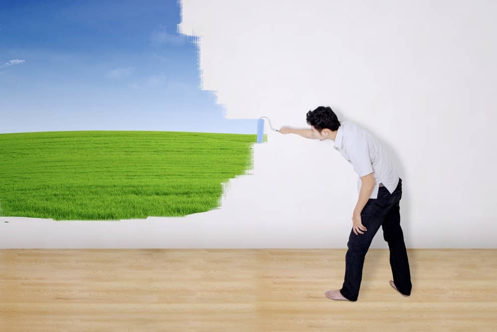
It’s a new decade, and although it may have gotten off to a rocky start, there is a way to freshen up your life and also to freshen up your home. If you’re looking for a new DIY project, then maybe home interior paint is where you should start.

2020 is the perfect year to change up the color scheme in your home. Some gorgeous tones have followed us into this new year. Perhaps one of them may be the solution to sprucing up your walls and giving you renewed inspiration.

Looking at various color trends can give you some interesting ideas for rooms. Shutterstock.

Trendy Paint Shades

Paint manufacturers and color experts are the ones who have shared what they think will be on-trend in colors this year. What have they got in store for us? Well, there certainly is something for everyone in their predictions.

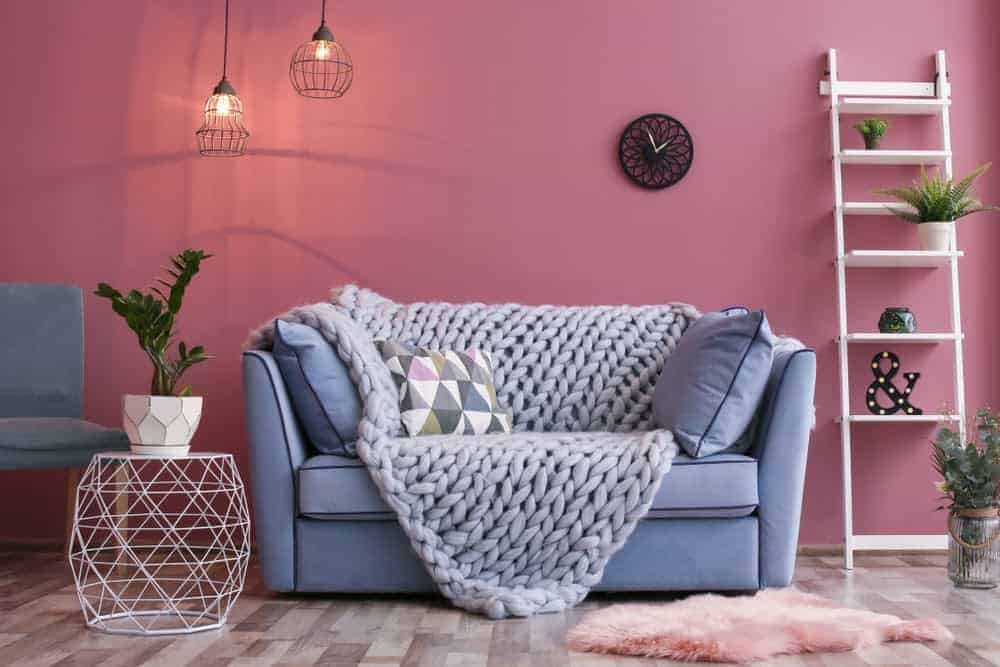
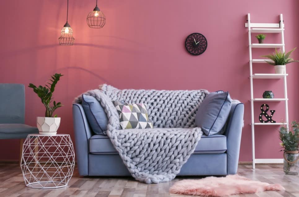
Some of their favorites for the year are earthy tones, pastels, and blues. Let’s learn some more about these amazing colors that have been created and could be going up on your living room walls very soon. First up is rich earthy tones that are inspired by nature.

There’s nothing with bringing the colors of outside into your home. Shutterstock.

Are You A Nature Lover?

If you’re someone who feels at one with nature, this could be the color palette you have been looking for. Paint manufacturers have predicted that one of the 2020 trends for paint will reflect the changing seasons. Which season is your favorite?

If you’re a fan of autumn, then you could opt for colors like chestnut or burgundy. If those are a bit too harsh for your liking, try a deep olive green instead. The hope with these colors is to bring an organic outdoor-indoor feel to the spaces in your home.

Brown earthy tones can be quite soothing. Shutterstock.

How To Use Tones In Your Home

If you’re wondering how to incorporate this look into your home, opt for colors that have a warm brown undertone. This is generally the foundation for these earthy colors that are so trendy at the moment. You could even try out a beige if you aren’t feeling bold as this falls into the earthy category.

If you’re feeling a little bit more adventurous in the new decade, go for a bold shade like tan or even a delicious chocolate brown. You can mix these tones with crisp white accents that will really pop thanks to the undertones of the earthy colors.

Don’t leave your cabinets untouched; they’ll stick out too much. Shutterstock.

Paint Your Cabinetry Too

Take the paintbrush to your cabinetry as well to feel the full effect of this new tone. If you want to go bold but aren’t ready to fully commit, just paint one accent wall, which will make a real interior design statement in your home that will wow your guests.

Painting an accent wall with earthy tones is a great way to begin to incorporate color into a more neutral space. It will also give you a chance to feel out the color and see if the room could take more of it. You need to consider the space and size as well.

Pastel shades can be a little whimsical, but also sophisticated. Shutterstock.

Pastel Shades Can Soothe Your Mood

If earthy tones aren’t to your liking, what about some soothing pastels? We’re talking pale pinks, light greens, and even blues. These tones are predicted to carry on throughout the year and be on-trend. What is so great about these colors?

They provide a very calming effect on the space that they are used in. After the start of the year, this could be an excellent option for everyone to use in their homes. If you find yourself very overstimulated during the day, especially your eyes, this is a tranquil space to come back to.

The grey can reduce the brightness of pastels for a more sophisticated look. Shutterstock.

Look For A Gray Undertone In Pastels

What should you be looking for when picking out your pastel color? Try to go for one that has a gray undertone. The reason for this is that it helps to diffuse the saturation of the intensity, which makes them even softer on the eyes.

Apart from just using pastels on your walls, they genuinely look stunning on cabinetry in your home. If your cupboards or desk of drawers need to be freshened up, try out some pastels on them to incorporate the color in small accents around your home.

Neutral colors are still as popular as ever and are always high on the color trends list. Shutterstock.

Are Neutrals Still On Trend?

Our previous decade showed that neutral shades were all the rage. However, in this new era, experts are predicting that consumers will make space in their homes for more saturated hues, which could provide excitement to previously dull areas.

If you’re wondering what colors this includes, imagine your wall with pale blush, slate blue, or even sage green. Try out your favorite color, but just instead in a softer version. A tip to finding these in a paint store is to look for shades that border the gray cards.

Blue is always a great color to go for because of its many shades. Shutterstock.

Feeling Blue And We Love It

The next trend on our radar is blue. Blue has been on trend for quite a while, and it seems as though this will continue this year too. There is a slight change in the shade of blue, in any case. The trend is moving towards a more profound and moodier tone.

A blue with amazing rich undertones would look incredible in a home. Naval is one of the colors of the year and is described as a timeless navy blue. Are you ready to take the plunge and have this painted on the walls of your dining room?

Science has shown that different colors can affect mood. Shutterstock.

Understand How A Color Makes You Feel

Something interesting to note is the way that people are picking colors for their homes. They are moving away from how the color will make the space look and move towards something a lot more personal than just a color swatch.

Sue Wadden, a director of color marketing at Sherwin-Williams, says, “People want to feel grounded and inspired to pursue their mental, physical and emotional well-being.” Because of this, people are picking colors by how it makes them feel.

Blue has been shown to make people feel more relaxed. Shutterstock.

One Of The Most Relaxing Colors

Blue is also commonly known to be one of the most relaxing colors in the world. Where should you use blue in your home? You could opt for having it painted in your living room, bedroom, or perhaps even an office where you want a calming environment to surround you.

Blue is also a great color to use in accents instead of painting. A deep navy blue could provide some much-needed depth to a room in your home. Add a beautiful blue chair, or perhaps some scatter cushions to break up your bland couches.

Take lighting into account when choosing colors, as they will look different in both room lighting and natural lighting. Shutterstock.

Work Around Natural Light

If the space you’re working with doesn’t provide much natural light, you should still go for cooler neutrals. The reason for this is that it will help to brighten the space and also helps to offset the lack of sunlight in the room. If you have a brighter space…

You can go for a warmer neutral. In your kitchen, a warm neutral will look fantastic if you have the light needed. It will help to slightly mute the brightness of the room and give it an all-round cozy feeling that will have you wanting to spend all your time there.

Green is a good secondary color to go for since it’s close to nature. Shutterstock.

Which Color Beats The Blues?

Move over blue, green is making its entrance now too! Consumers love green this year. We’re not talking about alarming lime green tones but a more organic and less-saturated tone of green. Think sage, moss, and olives.

It falls in line with consumers moving more towards earthy tones. When you think of green, it reminds you of nature and the foliage that can be found outside. Another color of the year is green and is called Back To Nature.

Consider the colors outside your windows and incorporate them into your home. Shutterstock.

Put A Landscape Into Your Home

When describing this color, you could call a “restorative, meadow-inspired green.” The inspiration behind the color is to inspire people to start reconnecting with nature, which is more important than ever in our busy and non-stop lives.

Take the color from the landscapes you see outside and put it right into your home. Bring in the feeling of fields of grass or a beautiful forest. You could even use this tone on your front door or living room as it works incredibly with wood tones.

Look at your home decor first to pick a paint color, not the other way around. Shutterstock.

Assess Your Decor Needs

Now that you’re feeling inspired to put a fresh coat of paint somewhere in your house, where do you begin when choosing the color you want to paint it with? The first step is not to pick your paint color first. This may seem like it should be the first step, but it’s not.

The reason for this is that it is much easier to choose a paint color that will complement the rest of the interior of your home rather than finding and sourcing the decor that will match the paint color you have chosen. So, first, assess your decor.

It doesn’t hurt to look up inspirational home designs based on the colors you’ve picked. Shutterstock.

Research Your Inspiration

Once you’ve done this, you can then start searching for inspiration for your color choice. Pinterest is one of the best resources for interior design ideas and allows you to put together a mood board for the room you are working on.

Start to pin the pictures that are inspiring you, and you’ll then get to see what you have been drawn to and what gives you a good feeling as this is very important, as we explained earlier. It will also give you a sense of your style that you are looking to create.

Pick a color that you really love and go from there. Shutterstock.

Be Inspired By What You Love

Sometimes the inspiration for a room can come from the most random thing, such as a mug with a color that you like. Perhaps you absolutely love gray but are scared that your home will feel cold if you choose this color. Luckily for you, warm neutrals are in.

Instead of choosing a cool neutral gray, opt for one that has a warmth to it. It will go well with slate grey furniture. You can add wood accents too to bring out the additional warmth of the grey and bring out that beautiful rustic feel that looks like something from a magazine.

One great way to make furniture stand out in your home is to paint with a contrasting color. Shutterstock.

Highlight A Piece Of Furniture

Perhaps there is an item of furniture in your bedroom that you love and would like to highlight it even more. This could be a great point of inspiration for you to start choosing your paint colors for the walls. You can try out a color even if it is a more neutral tone.

How do you decide if color is going to work in a space? First, you have to look at the room and make the decision about where the attention should be. If you decide that your walls will be the statement of the room, then go bold and big with your color choice.

The bolder, the better, as long as you add some muted colors as well. Shutterstock.

What To Do If You Go Bold

If you choose to go bold on the walls, this will complement a room that has more neutral decor and design. If everything in the place is bold, then you’ll feel like it is too busy because everything will be competing for your attention.

A surprising place that works really well with bold colors is a bathroom. This is because, generally, the interior of a bathroom is made up of neutrals. Your toilet and sink are usually white, and a color in this space could make it look modern and chic.

Not sure what color to go with? Get some tester pots and try them out to see how it looks in your home. Shutterstock.

Purchase Tester Pots

Once you’ve narrowed down your color selection, go to your paint store and purchase a few testers in the colors that you like. When you get home, paint a large enough area on the wall so that you can really get a sense of what the color is like in that space.

You can also have a look at what the light in the room does with the color at different points in the day. Most brands have testers available for a minimal amount, and it will be worth it in the end when you can pick the perfect shade for the room.

Keep the leftovers in case you really like that color and want to use it somewhere else. Shutterstock.

Don’t Discard Your Leftovers

If you have any leftovers from the sample paint pot, you can use it for painting other small projects and could use it to complement another space in a different room. This is a great way to connect the color throughout your home without painting all the walls the same color.

You should also leave these tester colors up for a week until you make the final decision on your color. If you’re following the advice of picking the color depending on your interior decor choices, there is another way to test the color in the space.

Use a poster board instead of applying directly to the wall so that you can move it around and see how it looks in different lighting. Shutterstock.

Paint A Piece Of Poster Board

Instead of just painting your walls with the tester colors, grab a piece of poster board. Completely paint the poster board with the color and then hold it up against the various sections of furniture that are in your room.

Once you do this, you will be able to see which shade will best suit the room. It doesn’t need to match everything correctly, but you will need to check that the undertones of the shade of paint work well with the furniture items in the room.

Paint sometimes have different textures added to them for different looks. Shutterstock.

What Finish Will You Choose

Just when you thought it sounded easy, you then have to choose the finish of your paint. If you pick a sheen paint, this will highlight flaws in the walls. So, if you want to mask these, try choosing a color that has a very minimal amount of sheen to it.

Flat or matte paint will have no shine at all in it. This type of finish is typically used in “low traffic areas.” These include rooms like the living room and bedrooms. You will also use flat or matte paint on the ceilings in the rooms of your home.

Matte paint can look really lovely and expensive. Shutterstock.

If You Don’t Want Any Shine

If you go for a flat enamel, this also has almost no shine. The perk about this type of paint is that it is quite easy to clean. If you’re someone who has kids or even pets, this could be a great option as maintenance on these walls is relatively easy.

Next up is eggshell enamel. This type of paint has a little bit of shine to it. You could consider this for areas in your home that are moderate traffic. This is good for a space also like your living room. It is also easy to maintain, and marks can be wiped off with a damp cloth.

Satin enamel finishes are great for trims and windows. Shutterstock.

Try A Satin Enamel For A Bit More Shine

If you want something with a bit more shine than these, pick a satin enamel. This type of finish works exceptionally well in high traffic areas and also areas that have moisture. This paint works well in bathrooms as well as kitchens.

A semi-gloss enamel is shiny, but it won’t look glass-like. If you want to use this paint for your color accent, try it on cabinets or trims. You can also use this type of finish in really high moisture areas such as bathrooms, saunas, or pool houses.

Extra shiny finishes are excellent in rooms that don’t have much natural light. Shutterstock.

Look For A Glass-Like Finish

Last but not least is the hi-gloss enamel. If the shiny look is for you, then you have found the type of finish that you need. When it is painted on a wall, it comes out with a glass-like finish and can work very well on surfaces like railings or even furniture.

Once you understand paint finishes, you also need to understand the undertones of the color. You can do this by using the darkest color on the paint strip to understand the actual color. What will this end up helping you with?

If you want to give each room a different look, don’t pick too many clashing colors, or it can look tacky. Shutterstock.

Consider Your Rooms In Relation To Each Other

You might think the paint is perfect, but you could then end up choosing a color that is too pink, blue, or even too yellow. Another tip is to continue to color stories throughout your home. This doesn’t mean painting every single room the same color.

What this means is that you need to consider your rooms concerning each other. However, you could be someone who wants a different style in each room, and this is great too. But for those of you who want a more harmonious feel, this is something you should consider.

Choosing several shades of the same color can create a harmonious look. Shutterstock.

Use Different Shades Of The Color

What you could do is use the same color throughout the house but use different shades – going lighter or darker in separate rooms. Instead of painting in other places, you could just choose to add accents of the color with the help of furniture, decor, or even trimmings.

If the space you want to paint is a small one, there are some dos and don’ts when you are picking out the color. First up is white. When thinking of a small space, our first thought is that the perfect color to paint it is probably white.

It has long been believed that painting a room stark white will make it look bigger. Shutterstock.

Will White Make Your Space Feel Bigger?

The reason we automatically go to white is that you would think that it would help to brighten up any dark spaces in the room and also would hopefully reflect light around the room to make it feel lighter and brighter without having to get a construction company in.

This concept is very dated, and you really can enjoy an almost unlimited color palette when working with a small space. Did you know that white paint in a small room could have the opposite effect and highlight the fact that it is a boxy space and also bland?

But depending on the lighting and the shape of the room, it can actually look smaller. Shutterstock.

It Could Have The Opposite Effect

It also sometimes will show the shadows and dark corners, which will make the room feel even smaller. It can sometimes work though if you use it instead as an accent or trim in the room rather than the full wall being painted with it.

Rather go for a color like gray and then add to it with white accents. The gray will add elegance and also a warmth to the walls of a small space. Could you go wrong even with notably muted neutrals in a small space too?

Muted tones are a great way to add color while still playing safe. Shutterstock.

Muted Neutrals Could Be The Solution

Muted neutrals are perfect for small spaces, and if you manage to find the right one, it really could help to make the room feel a lot more spacious than it is. This is all because of its simplicity. But, don’t be fooled and think any neutral color will work in the small space.

If the neutral is too muted, it could have the opposite effect. It could then turn the space into a dark one. You need to make sure you are choosing a warm neutral that will help to reflect the light around the room, and this is what makes it a real trend for 2020.

Add neutral tones like cream or beige to the trims of bold walls for an exquisite look. Shutterstock.

Finish It Off With Neutral Trimmings

Another trick to help your neutral space feel bigger is to complement it with neutral finishings. It includes furnishings, curtains, and linens that tie in with the color you have put on the walls. Also, don’t get lost in knowing what colors work in a small space.

This is just the beginning of picking the color for the room. A bad mistake would be choosing a color for a room just because it will make it look bigger. If you aren’t in love with this color, it’s not going to add any value to the room, and it will seem dark to you anyway.

There’s no point in painting a room in a color that you hate. Shutterstock.

Choose A Color That Makes You Happy

The end goal is to pick a color that brings you happiness and also highlights the space and makes it look great. The color you might love the most might not necessarily be the right pick for that room, but you need to really like the color regardless.

If you don’t like it, you don’t care how large it makes the room look. If you find a color that you like, you can also look at alternative shades of it that potentially work with the room better. Compromise a bit, but not too much when picking the shade.

If you’re still wary about going bold, pick one wall to be your accent wall. Shutterstock.

Don’t Be Overwhelmed By A Color

Red works brilliantly as an accent color in a small space. But, if you have your heart set on painting the room in red, choose your tone of it very wisely. Preferably choose a color like rust which will give you the warmth but without being overwhelmed.

Now, if you are ready to take the paint to the walls, there are some painting secrets and tips that you might not know about. The first tip is to make sure that your surface is ready to be painted. You need to make sure that your walls are perfectly smooth.

Before you begin painting, you should sand things down so that you have a smooth surface to work with. Shutterstock.

Stock Up On Sandpaper

This will result in your walls looking perfectly painted. Get stocked up on your sandpaper and make sure you sand it down to smooth perfection. It might be much work, but it will be worth it in the end. You will need to sand from the baseboard all the way to the ceiling

Next up, make sure that you are working with proper tools – specifically your paint and brushes. We can easily fall into the trap of opting for the more cost-effective paint and brushes, but you’ll end up costing yourself more in the long run as you’ll have to do it again and again.

Good quality paint is going to go on much more smoothly than cheap paint. Shutterstock.

Choose Good Quality Paint

Good quality paint will provide you with the easiest and best coverage. And also it will last a long time. With good quality paint, you will be able to clean it easily without all the paint work coming off. Your paint job will be quicker and better.

Before you start painting in a room, make sure you move all of the furniture that you can. You don’t want to end up with things being painted that you never intended on. But what if you can’t move the furniture out of the room?

You may think yourself a perfect painter, but accidents can happen, and your floors and furniture shouldn’t have to suffer. Shutterstock.

Protect Your Furniture From Paint And Dust

Instead, move all the furniture into the middle of the room and buy some plastic sheeting. You can then use this to cover all the furniture and then tape it around the bottom to make sure that it is well and truly safe and protected from any painting mishaps.

This will also protect your furniture from any dust that may be a result of sanding your walls. The next tip is about drop cloths. Instead of using bedsheets as your drop cloths, you should be using canvas drop cloths – this is what the pros use.

Canvas drop cloths are cheap to purchase and serve many functions. Shutterstock.

Purchase A Canvas Drop Cloth

Bed sheets won’t stop the paint splatters from ruining your floors. Plastic also isn’t a good option as the paint on it will stay wet for a while, which could get onto the bottom of your shoes and then get put all through your house when you don’t realize.

The best alternative is a canvas drop cloth. The perks about this are that it’s not slippery, like bedsheets, and they also are very absorbent. If it’s a big spill of paint, be quick to clean it up as it could still bleed through the canvas drop cloth.

Before you paint an entire room, paint one wall first, and wait for it to dry before moving on. Shutterstock.

P41

This next tip might seem quite obvious, but it’s an important one. Start with one wall and finish it before moving onto the next one if you have decided to paint the entire room. Some people might think they should do all the corners and trim, then go back to the walls.

According to the painting pros, this is not the way to do it. If you want a seamless finish, you will want to paint one wall in its entirety before starting the next one. It will help the brushed and rolled paint blend better than if you’d done the rolling once the brushed was dry.

Remember to clean your brushes thoroughly so that they don’t dry out and get stiff. Shutterstock.

Prevent Your Paint And Tools From Drying Out

Another great tip is to keep your paint bucket or container covered with a damp towel when you are switching between your brushing and rolling. This will help to keep your paint and tools from drying out when you aren’t busy with them.

Last but not least is – buy an extra bucket or two of your paint. Unless you’re very keen to get it painted, you won’t have a freshly shaken paint for the whole DIY paint session. You won’t be able to bring your settled paint back to form with just a stir stick.

In the end, paint your rooms however you want. Shutterstock.

Let The Creative Juices Flow

Now that you have tips about color choices, color trends, and how you should paint like a pro – it’s time to get started and get inspired. Remember that Pinterest is an excellent source of inspiration and can really get those creative juices flowing.

The color trends for 2020 are fascinating and will be much fun to redecorate your home with. Start the new decade with a new look that could add new life to your home or even just to a room that has lost its spark.

Sources:

https://www.bhg.com/decorating/color/paint/2020-paint-color-forecast/

https://www.heytherehome.com/8-tips-choosing-right-paint-color/

https://www.thespruce.com/worst-paint-colors-for-small-spaces-4124357

https://www.popularmechanics.com/home/interior-projects/how-to/g151/13-painting-secrets-the-pros-wont-tell-you/

Advertisement