Embarrassing Design Fails that Someone Should Have Been Fired For

Sai Leigh - November 19, 2022
Share

Being an architect comes with a lot of responsibility. Mainly, designing and building things correctly so that they’re not only safe, but functional. Unfortunately for the architects on our list they didn’t quite make the cut. Whether we’re talking about highly anticipated public architectural projects or residential basics, it’s easy to see that not everyone with an architect’s certification should be putting ideas out into the world.

SB Nation

Ekaterinburg Arena – High Expectations

Let’s start BIG. When it comes to sports, fans take everything extremely seriously. In fact, games can get dangerous, but not always for the reasons you’d expect. This soccer stadium in Russia was used in the 2018 World Cup. Home to the FB Ural in the Russian Premier League (yeah… we don’t follow sports, either), the stadium originally seated only 27,000 fans. That’s actually about average when it comes to soccer stadium capacity, but it wasn’t enough for the popular World Cup event. In fact, organizers and architects decided that additional seating was needed and they added almost another 20,000 seats. Outside of the arena. That’s right, the seats were built outside of the arena, in the open air. We’re assuming some safety planning took place, but judging from these photos it’s hard to tell. At this point, is it even worth attending the game, when a near-death experience is involved?

Pinterest

Need Cash? Beg for It.

Banks and other public agencies can often be squeezed into odd spaces. They make use of older buildings with some wonky character, but in general they’re charming. Not this bank. No, they decided that the best place for an ATM was approximately a foot off the ground. This is actually the opposite of the usual problem we have in the US – having to reach your entire body through the car window to get your card in the card reader slot. But we’ll take that any day over having to actually kneel to use the machine. Add to the fact that this is a pretty vulnerable position, and it’s surprising anyone chooses to use this ATM – or that someone designed it to fit into the building this way.

Twitter

Fashion, not Function

These balconies are hilarious because they are very obviously not useable. Balconies are a selling point when it comes to homes and apartments, and in cities they can provide additional living space for renters – as well as a hefty price inflation. But there’s no way to enjoy that fresh city air if you’re a tenant in this building. Whoever designed these blue prints was especially cruel, setting things up so that the windows look out directly on the enticing space, but there’s no safe way to get to the balcony. Like, for instance, a door. Maybe there’s a chance that a daring leap could get you some rest and relaxation on these balconies, but it’s probably not worth the risk.

Buzzfeed

High Hopes for the Handicapped

The Americans with Disabilities Act (ADA) is intended to make sure people with disabilities have access to necessities and public spaces. The legal battles for this kind of accessibility are far from over, with most public places checking the boxes but not actually providing useful amenities. Take this ramp for example. It’s extremely ambitious to think that anyone in a wheelchair or even with crutches would be able to get up and down it without a fight. The ramp is so steep that even those without mobility disabilities would have a hard time using it. And… there’s no railing on that side, either. Unfortunately, ramps like this still litter cities and don’t actually do much when it comes to making public spaces accessible.

Boredpanda.com

When Old Meets New

There’s a lot of nostalgia around older architecture, and architects may in some cases be tempted to try and work around what was already there. After all, “they don’t make them like they used to.” Many buildings have truly stood the test of time, and in modern settings have a sort of dignity about them. This building in London was probably quite dignified at one point with its pillars and stonework, which might be why they tried to preserve it. Unfortunately the sleek, modern addition clashes horrendously with that old-world charm to make a pretty ridiculous looking façade. The noble lines of the original building just don’t line up with the sexy curves of the new. A fresh start may have been a better choice but at least this architect has an appreciation for art.

Demilked

You Shall Not Pass

Even the students called out the stupidity of this design. What you’re looking at is a walkway in a high school, leading from one section of the school to a stairwell. Walkways are, somehow, part of the excitement and drama of adolescence. Seeing friends in the hall, checking everyone out, huddling up to chat and gossip. But the designer of this hallway must’ve had something against functionality or students getting to class on time. The huge support beams, no doubt essential to holding up the rest of the building, very clearly block the majority of this walkway. Students’ only option is to squeeze through or step across the V-shaped space. Guess this one just stumped the experts when they were drawing up the blueprints.

Demilked

A Sleepwalker’s Nightmare

It’s not always the big-name corporate architects who mess up, but also residential experts. When a house is built there are quite a few things that need to be crossed off the list. Zoning laws need to be met, all electrical needs to be planned out and approved, an architect and engineer need to approve the support structure. So how did this doorway to death get overlooked? One wrong step will send anyone tumbling down the stairs and likely end in serious injury. This isn’t just a step up, but completely removed from any kind of landing that makes sense. It’s unclear if this was an intentional design choice or part of a renovation, but either way it’s obviously a poor decision.

Liveabout

Toilet Phobia 101

Toilet phobia, social anxiety, pee-shy – whatever you want to call nightmare bathroom situations, this is one straight out of a horror movie. Public bathrooms are really hit-or-miss but we aren’t sure what the architects were thinking when they drew up this plan. Is a game of chicken supposed to take place? Do you get to know your bathroom buddy? Interestingly, a quick look at the walls and floor seem to indicate that there were never even stalls in this room to separate the toilets. So they were intentionally set up to face one another and push social boundaries. We’re not sure what’s worse – the dueling toilets or that crusty looking floor.

Livabl

Do They Know What a Garage Is?

Listen, it’s totally up to you what you use your garage for. Whether you like to store seasonal stuff in there, work on your car or motorcycle, have a band meeting once a week – we won’t judge. But the whole point of a garage is for it to be accessible, especially because most people park their vehicles in it. You aren’t getting a car in this garage without a heavy-duty lift. It’s impossible to figure out just what the architects were thinking or why the owners decided this house was a good deal. Maybe it was discounted due to some unusual… features? Either way, having a beer in the garage and checking out the neighborhood could easily turn into a dangerous activity with that second story fall.

Arch20

A Local Eyesore

Frank Gehry, famous architect and designer of the Guggenheim Museum Bilbao in Bizkaia, Spain, was commissioned for the Walt Disney Concert Hall in 1999. Gehry had impressed many people with the Guggenheim and the Disney LA building was set to stun as well. The building sketches an impressive silhouette on the skyline. Sweeping curves and metallic siding reflects the blue sky and sunlight. But problems quickly cropped up. That reflective metal siding – called cladding – redirected the sun’s rays onto neighboring houses and buildings. This not only caused a glare (and a ton of traffic accidents because of it), but a serious rise in temperature too. Gehry’s solution was to sandblast the panels causing the problems and while it sort of worked, it added a hefty amount to the construction bill.

Retail Hell Underground

Rainy Day Problems

Sometimes the most obvious design flaws, no matter how small, are easily pointed out when day to day life grinds to a halt. This is true of this particular sewer drain. You know that saying “you had one job”? Here’s the personification of it. Drains are actually installed by maintenance workers for towns, cities and states, but there’s an extensive round of planning behind these installations, and a clear process. Obviously whoever installed this drain wasn’t paying attention to the level of the surrounding ground and completely missed the mark. There’s an impressive amount of flooding in this photo and it kills us to know that they were JUST. SO. CLOSE.

Loveproperty

Loving the “Loft” Space

Big city architecture can get crazy when it comes to landlords and renting. As more and more prominent corporations snap up apartment buildings, they try to squeeze living spaces into smaller and smaller areas. In some cases this results in comically tiny apartments, like the one pictured above. This is a flat located in London that tries to make use of as much space as possible. Unfortunately, they did so poorly. In the near right corner a couch is visible so this is apparently the living space. The architect laid out a small kitchen/washer section in what looks like a 5x5ft area and, to really upsell the place, added a “loft” bed. We’d say bedroom, but realistically, this is a mattress on stilts. Getting down that ladder in the middle of the night to pee would be a real gamble.

New York Daily News

Taking the Heat

The Pier One playground in Brooklyn, New York was initially welcomed by the community. Parents were excited to have a place for kids to play, and the design looked simple yet attractive. Everyone knows one of the most exciting parts of a playground is the climbing equipment. In an attempt to give this park a clean, modern aesthetic, architects designed several steel domes for climbing. It became apparent immediately that on hot days you could literally fry an egg on the steel, so the last thing parents wanted was for their kids to play on the structures. The domes temped in at 127 degrees on a particularly hot day. The city quickly sectioned the domes off with fencing and posted signs, eventually removing them completely. At least someone saw the light in this situation and owned up to design flaws.

Buzzfeed

The Doorway to Temptation

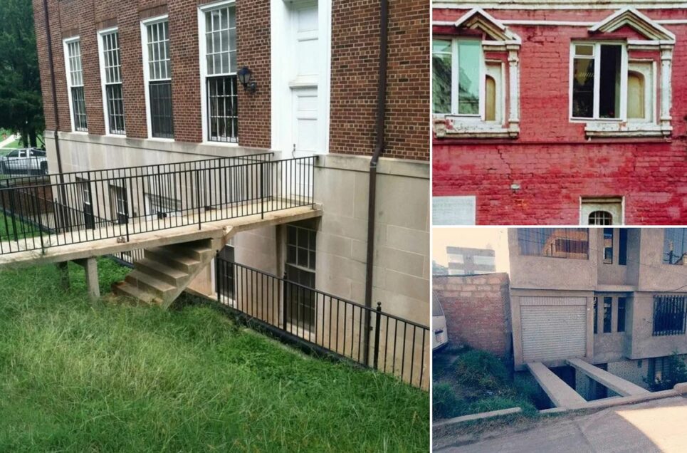
Our first thought is, why would you build a door into a wall like that and immediately install a railing over it? And our second thought – what are they hiding behind it? Everything in this photo shows how poorly decisions were made. Aside from the door being very obviously misplaced and inaccessible, something is up with the tile. It takes a sudden turn on the right side of the door and angles downward in a way that any designer knows is a big no-no. Whether this door was installed prior to or after the stairway doesn’t really matter. What it all comes down to is common sense. There were more than a few ways to avoid this disaster.

Pinterest

Lofty Hopes

Somehow, this architectural design is still very much in play in both residential and commercial buildings. We’re not sure if this is a hospital, hotel, or what – but it’s obviously not someone’s home. The architects decided to make use of the space over the main entrance as a… loft? What are these areas, actually? Are they for showcasing high-end items, or are they just poorly utilized extra space? This business, whatever it is, decided to class up the loft with a sitting area. It is completely inaccessible and pointless, but hey, when this is what the architects give you to work with, you do what you can.

Loveproperty

Putting Yourself on a Literal Pedestal

There are so, so many things happening here beside the obvious. Let’s start by addressing the elephant in the room: the atrociously tiled elevated bathroom. Bathrooms are all about privacy, but using this one will make you feel like royalty. At least two feet off the ground, the toilet is raised higher than the pedestal sink that sits immediately next to it instead of, say, literally anywhere else in the huge space. Is this room actually a bathroom? Other fixtures make that unclear, such as the air conditioner, woven rug, and stairs leading into another room. And don’t even get us started on the statue to your left.

Awesome Inventions

Everything the Light Touches…

This four-story home with terrace (or porch?) included brings one word to mind: pretentious. Either the architect who drew up this design was pressured by rich idiots or had absolutely no chill. This really looks like three or four houses crushed into one, with different stylistic choices combined to create a mess. With a stone base, lighthouse-esque front facing design, side balcony, stairwell (maybe) and, to literally top it off, a porch held up by stilts, there’s no way this house wasn’t going to look moronic. Just think of how terrifying that porch is after a few beers. But hey, you can easily spy on the neighborhood from way up there.

Realtor.com

Dual-Purpose Sink

Let’s take things down to a smaller scale with this sink. Whoever designed this kitchen was either indecisive or really, really hates having to soak and clean their dishes in one basin. Technically this isn’t actually a bad design. You can clearly swing the faucet from one basin to the other. But is it realistic? After all, each sink is so small – that wine glass would easily take up most of the space in one. And what do you really need two sinks for, anyway? Add to the fact that this was all designed at a literal angle – the corner of the counter, where you should never put a sink in the first place. The architect was probably hoping this would be the “next big thing” in kitchen design, but it’s more of an eyesore.

Interesting Engineering

Leaning Tower of Stata

The Ray and Maria Stata Center in Cambridge, MA was designed by Frank Gehry for the Massachusetts Institute of Technology. Yes, the same Frank Gehry who showed up earlier on our list with his Walt Disney Concert Hall. The State Center was built in 2004, years after Gehry made that first blinding mistake in LA. But critics were quick to point out design flaws – and not just other architects, but everyday attendees at MIT who walked the leaky, cracking and moldy hallways. Lawsuits were brought against Gehry and the construction company for “deficient design services and drawings.” The Stata Center was dangerous in an impressive number of ways. Those utilizing the building had to deal with not only mold and regular water leaks, but falling ice and debris as well. Gehry brushed the criticism off by explaining that “these things are complicated.”

Twitter

An Off-Center Piece

The architect of this home has clearly never seen a fireplace before. For whatever reason, this fireplace was built noticeably off-center. It seems like they thought shifting the mantle over might make the design flaw less noticeable, but it only draws our attention to the weird use of space on either side of the chimney. Because what is going on with that TV squashed into the corner? Is that really supposed to be a working desk under it? And on the right side of the fireplace, it’s impossible to tell what the function of that built-in is. The upper part appears to be a shelf, but it ends abruptly and has angled sections tilting backwards. This design will make your eyes cross if you look at it too long.

Loveproperty

What’s the Angle Here?

If you’ve been in the market for a house, you’re probably familiar with the term “dormer.” A dormer on a house is usually a second floor space with sloping walls and windows installed strategically due to all the angles. While it’s not uncommon for houses to have angled second stories due to sloped roofs, something more is going on here. Luckily whoever painted the space did so in a way that makes all of the mistake obvious! Most immediately, the door is in such an odd spot and actually had to be cut at an angle to fit the frame. That was an intentional move, because the interior wall (also at an angle) could have easily been shifted over a few more feet to accommodate a normal-sized door. But no, they needed to make room for the awkward little steps, platform, ladder and loft area?

Realtor.com

Here I Go Again on My Own…

Kitchens can be tricky spaces to design because each homeowner has their own preferences. Whether they prefer cabinet or counter space, an open floor plan or galley-style, it can be a tough call on what will best sell a home. But this architect went completely off the map when designing this particular floor. It’s not quite open, but close to it? The dark cabinets and dark wood flooring are actually beautiful, but ruined by the standalone refrigerator just sitting out in the middle of nowhere. To make things more awkward, it was a very intentional decision that involved making a frame for the appliance as well. A permanent frame. As you can see in the first photo, the fridge is at such an awkward angle that it ruins those beautiful floors. It’s a safe bet that no buyers would be thrilled with this design.

Disabled Access Denied

The Never-ending Ramp

Let’s circle back to the issue of unrealistic handicap ramps once more. Here’s a prime example of a ramp that is technically useable, but also a nightmare for anyone with a wheelchair or other mobility issue. Just think of the amount of lumber that went into building this thing. It’s unclear how old this building is, but the architect should have considered a simple wheelchair lift, at this point. The finished product for this handicap ramp looks like a game of marble run.

Pinterest

No Student Left Behind. Except This One.

Okay, schools can be tricky to build. There are just so many features to take into consideration – gyms, a lunch room, specialized classrooms. Add to that the fact that many schools like to separate out the freshmen from the sophomores, etc., and designing a middle or high school will give you a headache right from the start. But the kids should come first, right? So why decided to put this support column directly in front of a row of lockers, making a few of them inaccessible? Are those lockers purely aesthetic, or are students expected to make the most of what they got? Coming in to this locker on your first day would definitely be an omen.

Loveproperty

An Appreciation for Nature

One of the hardest parts about being an architect is planning for the uncontrollable – which is often nature. Nature can ruin the best laid plans in many ways, but in this case, it looks like nature got there first. So why bother building a garage directly behind this (at the very least) decades old tree? Maybe they thought it would add property value anyway, as an additional storage space – even if the homeowner can’t park a car there. Hopefully this garage is located somewhere sunny, where a structure for protecting your vehicles from the elements – right outside your door – is not necessary.

Reddit

Watch Your Step

Roof access is an important part of any residential or commercial building. But it shouldn’t be set up like a James Bond-style architectural design. In this situation, we can’t tell how much space there was on the roof, but probably enough to face this access door in any other direction. Just imagine trying to have a romantic night on the roof with your significant other, sneaking up with no one noticing, opening the hatch and… stepping out to plummet over the edge. It’s surprising this even passed zoning regulations and safety checks.

Reddit

Crowning Achievement

This looks like it might be a seaside resort town, and we all know resorts go above and beyond to look classy. Usually at a very cheap cost. Whoever designed this building (a restaurant or bar?) obviously had function in mind, as their roof centerpiece is an exhaust fan. Impressively, it’s not immediately noticeable as an eyesore, and almost blends in with the tiered vibe going on. We have to give them props, as other fails on this list have been completely unfunctional. This is just unattractive.

Reddit

Couldn’t Decide on a Style

For architects, certain clients are walking disasters. This house is probably a result of a few oddly chosen stylistic choices that the client didn’t realize wouldn’t work well together. It has a modern, contemporary look that is completely thrown off by the double support pillar – just one – holding up the overhang outside of the entrance. We’d like to think it was just a funny temporary fix until the real support system was installed, but the highly permanent stone base says otherwise. Fingers crossed that those aren’t actually three side-by-side sun lights on the roof!

Weebly

Not the Best “Vision”

What exactly was this architect going for when they created this Vision building? According to their website, it’s styled after videogames. But the oddly angled and colored windows, with the off-kilter form of the building itself, make us think they haven’t played any videogames since Pacman came out. Angles can be an architect’s best friend or they can totally confuse the eye, which is exactly what’s happening in this situation. They’re definitely showing their age in this design and should pick up a more modern controller.

Architectural Digest

Beautiful Disaster

Fallingwater, a design of the famous American architect Frank Lloyd Wright, gained notoriety for its beauty and Japanese influence. The home was beautifully integrated into the surrounding Pennsylvania forest with a very nearby water source. But soon after it also started gaining an awful lot of complaints from occupants. While hanging over a woodland waterfall is picturesque, it’s also a perfect recipe for disaster. Constant humidity and moisture created a mold-heavy environment and the living space became unlivable. As if that wasn’t enough, the structural components of this home also began to fail and the section overhanging the water started drooping downwards. It’s been fixed up since, but the ideal was already tainted.

National Trust for Historic Preservation.

Like a Moth to a Flame

When Dr. Edith Farnsworth commissioned this home from famous architect Ludwig Mies van der Rohe, she probably thought the initial design was stunning. And in theory, it was and is. The home is beautiful with floor-to-ceiling glass walls and clean, solid lines. With a white interior and park-like surroundings, it’s hard to find a flaw. At least, until Mother Nature showed up. Dr. Farnsworth quickly realized that a nearby stream would regularly flood the home and an army of insects were attracted to it every single night, due to the glass walls making it the only light source in the area. It was also poorly ventilated and started to rust in some areas, bad enough that Farnsworth sued the architect. Today the home is a museum and has been restored meet the daily needs of the staff and realistic functions.

Advertisement